

Further Lane
Further Lane, Hamptons, New York
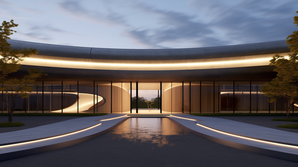
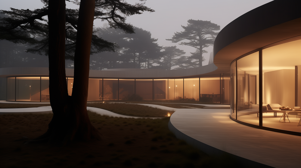
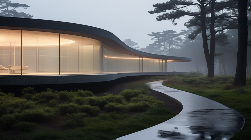
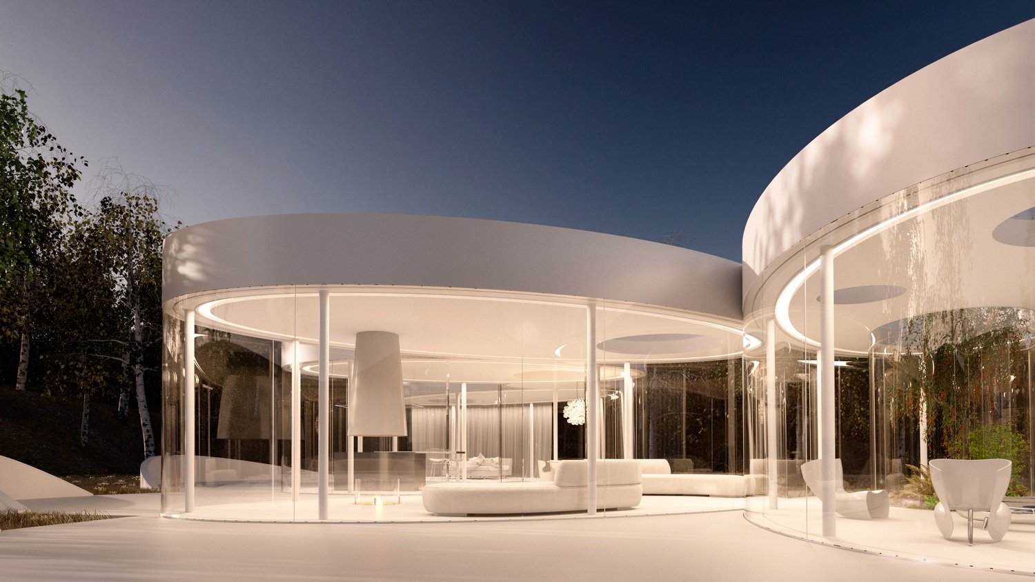
The opulent residence, spanning an impressive 12,000 square feet, graces the prestigious Further Lane in the Hamptons, standing as a testament to avant-garde architectural brilliance. Crafted for a discerning business magnate and avid art collector, this dwelling transcends traditional boundaries through its lavish embrace of sinuous and dynamic forms.
Private Residence for an Art Collector
Further Lane, Amagansett, New York
”It’s a project of a lifetime”
- John Beckmann
The opulent residence, spanning an impressive 12,000 square feet, graces the prestigious Further Lane in the Hamptons, standing as a testament to avant-garde architectural brilliance. Crafted for a discerning business magnate and avid art collector, this dwelling transcends traditional boundaries through its lavish embrace of sinuous and dynamic forms.
Nestled on an exclusive property seven acre property, the home seamlessly integrates with its surroundings, creating a harmonious dialogue between nature and architecture. The sinuous lines that define its structure are a deliberate departure from conventional geometric rigidity, adding an element of fluidity and grace to the overall design. These sinuous forms not only serve an aesthetic purpose but also contribute to the functionality of the space.
The play of light and shadow on the undulating surfaces enhances the visual drama, creating a dynamic interplay that evolves throughout the day. Large expanses of glass blur the distinction between indoor and outdoor spaces, inviting the beauty of the natural environment into every corner of the residence. The avant-garde approach extends to the interior, where innovative spatial arrangements and cutting-edge materials converge to create a truly immersive experience.
As an art collector's haven, the home features carefully curated spaces that serve as a canvas for the display of masterpieces. Each room becomes a dialogue between the architecture and the art it houses, fostering a symbiotic relationship between the two.
This 12,000 square foot masterpiece on Further Lane stands as a beacon of contemporary design, pushing the boundaries of what is possible in residential architecture. Its sinuous and dynamic forms redefine luxury living, offering an unparalleled experience for the connoisseur who seeks not just a home, but an artistic expression of lifestyle and sophistication.
Architect: John Beckmann
Design Team: John Beckmann and Catherine Readick
Total Area: 12,000 sq. ft.
© Axis Mundi Design LLC

Cloud House
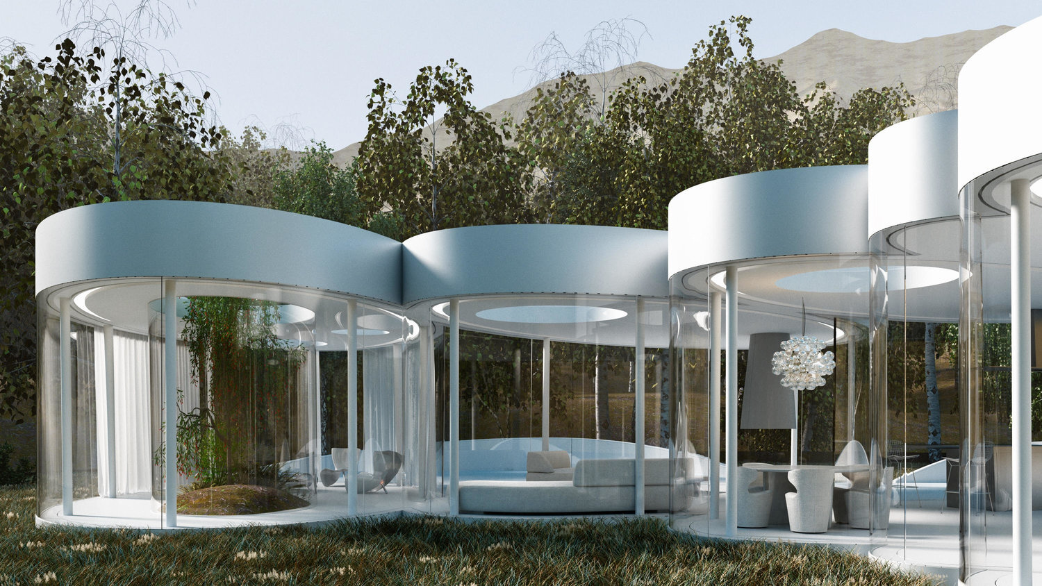
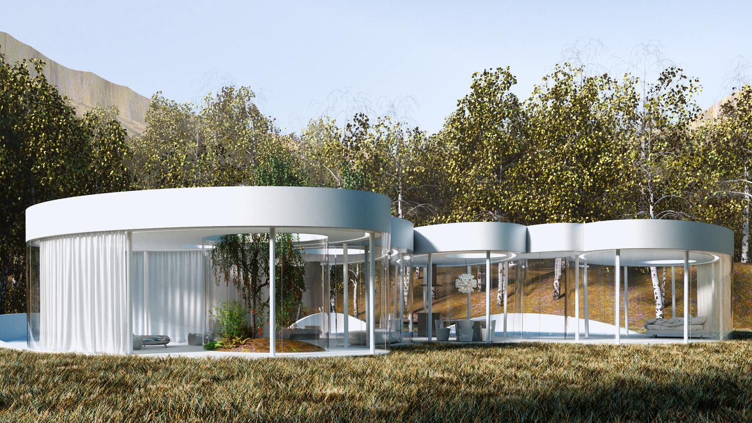
This weekend retreat, nestled in a grove of aspens in Lizard Head Pass, Colorado, embodies the words of Henri Poincaré: “Ideas rose in clouds; I felt them collide until pairs interlocked, so to speak, making a stable combination.” It directly challenges many of our ideas about home. Rather than a place offering the illusion of protection from the outside world through solid structure, its openness, light and reflectivity make it arguably more transparent than even Philip Johnson’s iconic Glass House.
Cloud House
Lizard Head Pass, Colorado
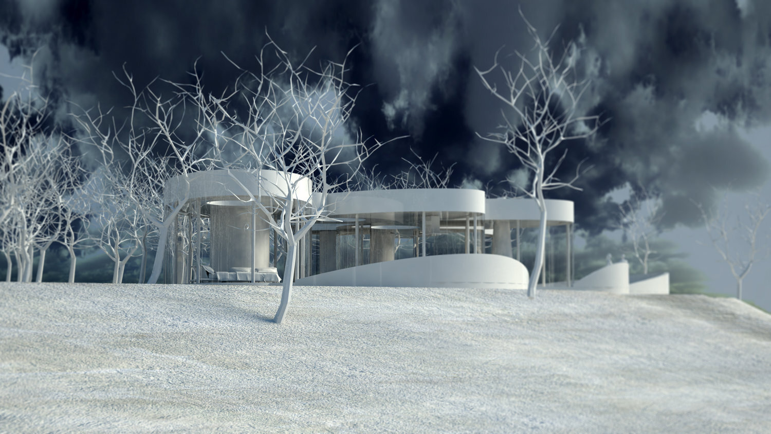
This weekend retreat, nestled in a grove of aspens, embodies the words of Henri Poincaré: “Ideas rose in clouds; I felt them collide until pairs interlocked, so to speak, making a stable combination.” It directly challenges many of our ideas about home. Rather than a place offering the illusion of protection from the outside world through solid structure, its openness, light and reflectivity make it arguably more transparent than even Philip Johnson’s iconic Glass House. Featuring a floorplan that is an abstract interpretation of a cumulus cloud, the home’s five rotated, elliptically shaped glass pods approach invisibility at certain times of the year. Each pod serves a distinct programmatic function, though together they facilitate an easy and fluid flow accomplished by minimalist doors placed at the interstices where the pods meet. It functions as an ethereal meeting place between earth and sky.
Architect: John Beckmann
Design Team: John Beckmann, with Jacob George
Visualizations:: Catalin Sandru.
Diagrams and model: Jacob George and Jessica Marvin
Total Area: 2400 sq. ft., 600 sq. ft. exterior deck.
Major Materials: Steel structure, curved architectural glass, anodized aluminum, and epoxy flooring.
© Axis Mundi Design LLC

XYZ House
The horizon is the line that emphasizes the infinite
- Victor Hugo
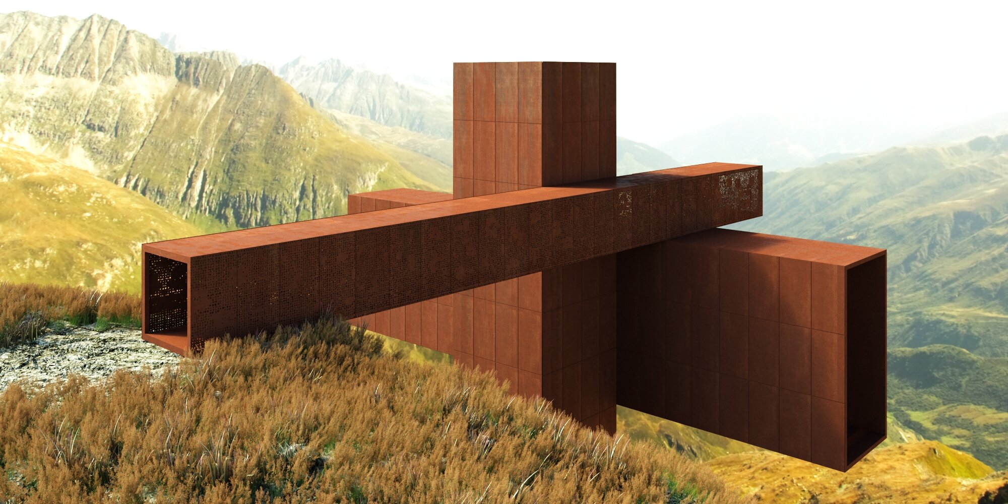
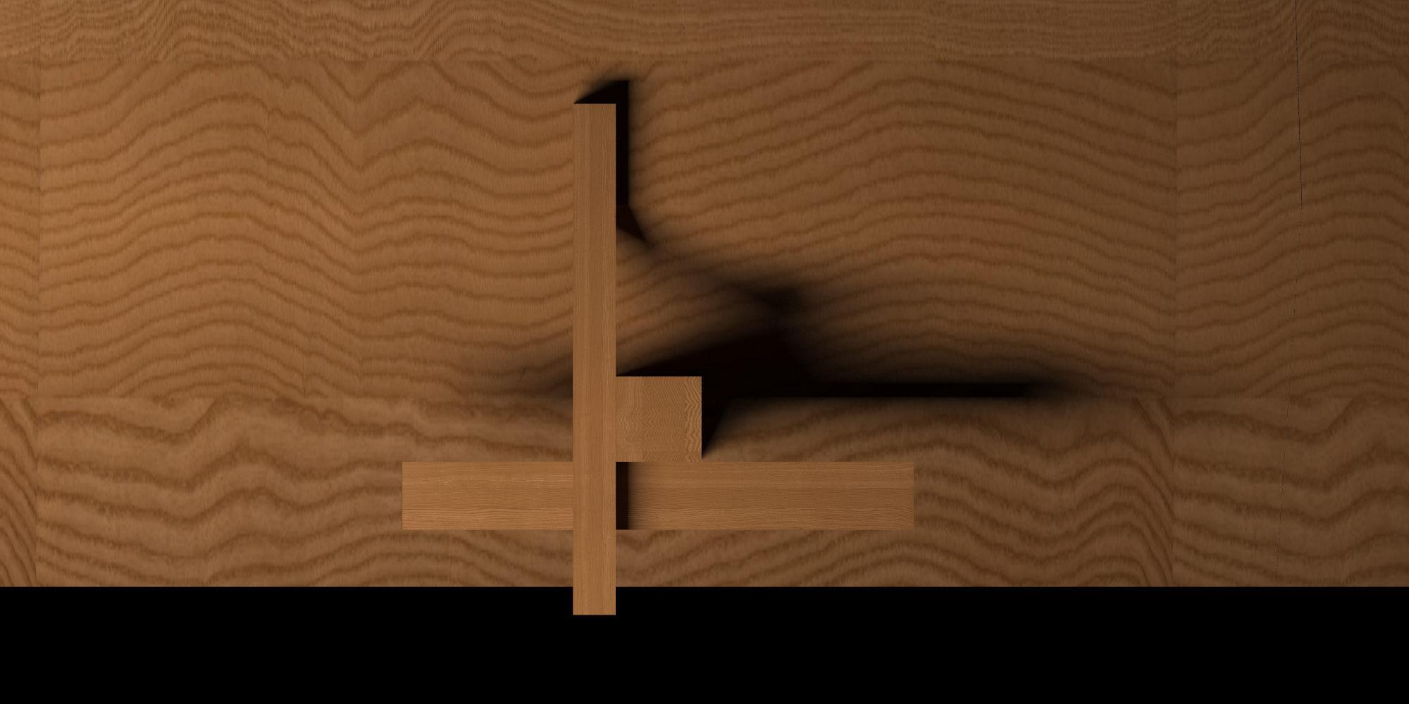
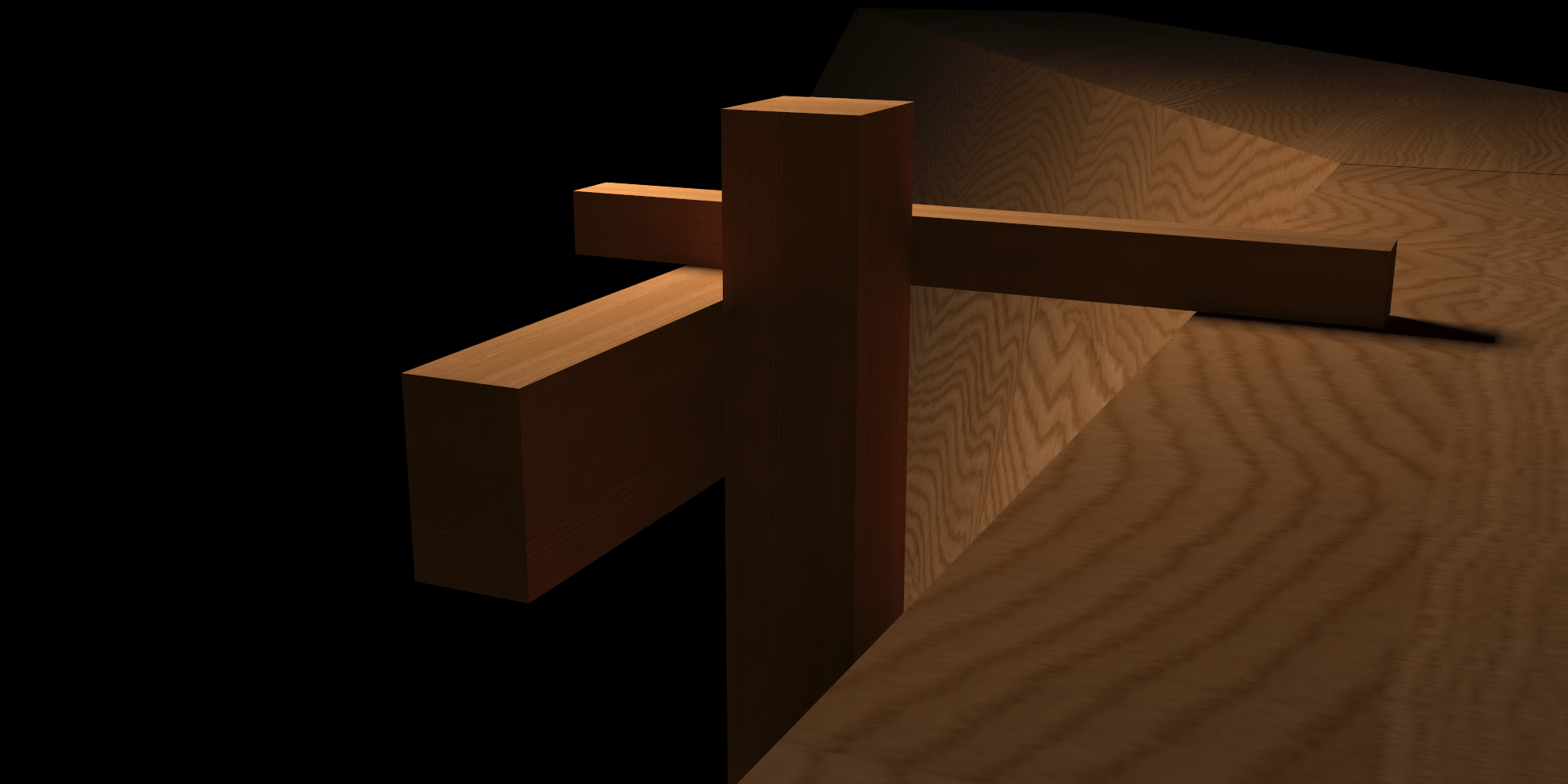
Sitting majestically high in the Alps, the cruciform like assemblage contains three bold architectural volumes clad in corten steel. Conceptually the project is organized by three mutually perpendicular planes (the three Cartesian coordinates of x, y, and z): An entry tunnel/bridge, a tower which contains the vertical circulation (staircase and elevator), and the main habitable space, which is suspended weightlessly above the valley below. In essence, this is a dwelling meaningfully stripped of all nostalgia from the material world. One is immediately reminded of the great German romantic poets and painters like Caspar David Friedrich and the poet Heinrich Heine, who’s work emphasized the tension between the daily world and the irrational and supernatural projections of creative genius. The project is a ruin from the future and its poetic power lies in its supreme muteness, as a place to contemplate the horizon and eternity in silence.
Architect: John Beckmann
Renderings: Catalin Sandru
Total Area: 4000 sf. Major Materials: Steel and concrete structure, corten steel, and glass.
© Axis Mundi Design LLC
“The horizon is the line that emphasizes the infinite”
— Victor Hugo
XYZ House
Wengen, Switzerland
Sitting majestically high in the Alps, the cruciform like assemblage contains three bold architectural volumes clad in corten steel. Conceptually the project is organized by three mutually perpendicular planes (the three Cartesian coordinates of x, y, and z): An entry tunnel/bridge, a tower which contains the vertical circulation (staircase and elevator) and the main habitable space, which is suspended weightlessly above the valley below. In essence, this is a dwelling meaningfully stripped of all nostalgia from the material world. One is immediately reminded of the great German romantic poets and painters like Caspar David Friedrich and the poet Heinrich Heine, who’s work emphasized the tension between the daily world and the irrational and supernatural projections of creative genius. The project is a ruin from the future and its poetic power lies in its supreme muteness, as a place to contemplate the horizon and eternity in silence.
Architect: John Beckmann
Visualizations: Catalin Sandru
Wood Model: XiaoLun Chen
Total Area: 4000 sf. Major Materials: Steel and concrete structure, corten steel, and glass.
© Axis Mundi Design LLC

Lagos Mosque
Temporal Fusion: The Lagos Mosque's Resonance with Nigerian Heritage and Modernity
Nestled in the heart of Lagos, Nigeria's vibrant metropolis, a distinctive mosque rises, seamlessly blending the city's architectural dynamism with Nigeria's rich cultural heritage. This edifice is not merely a sanctuary for worship but a profound testament to the intricate dance between Lagos's urban spirit and the timeless elements that define mosque architecture.
Temporal Fusion: The Lagos Mosque's Resonance with Nigerian Heritage and Modernity
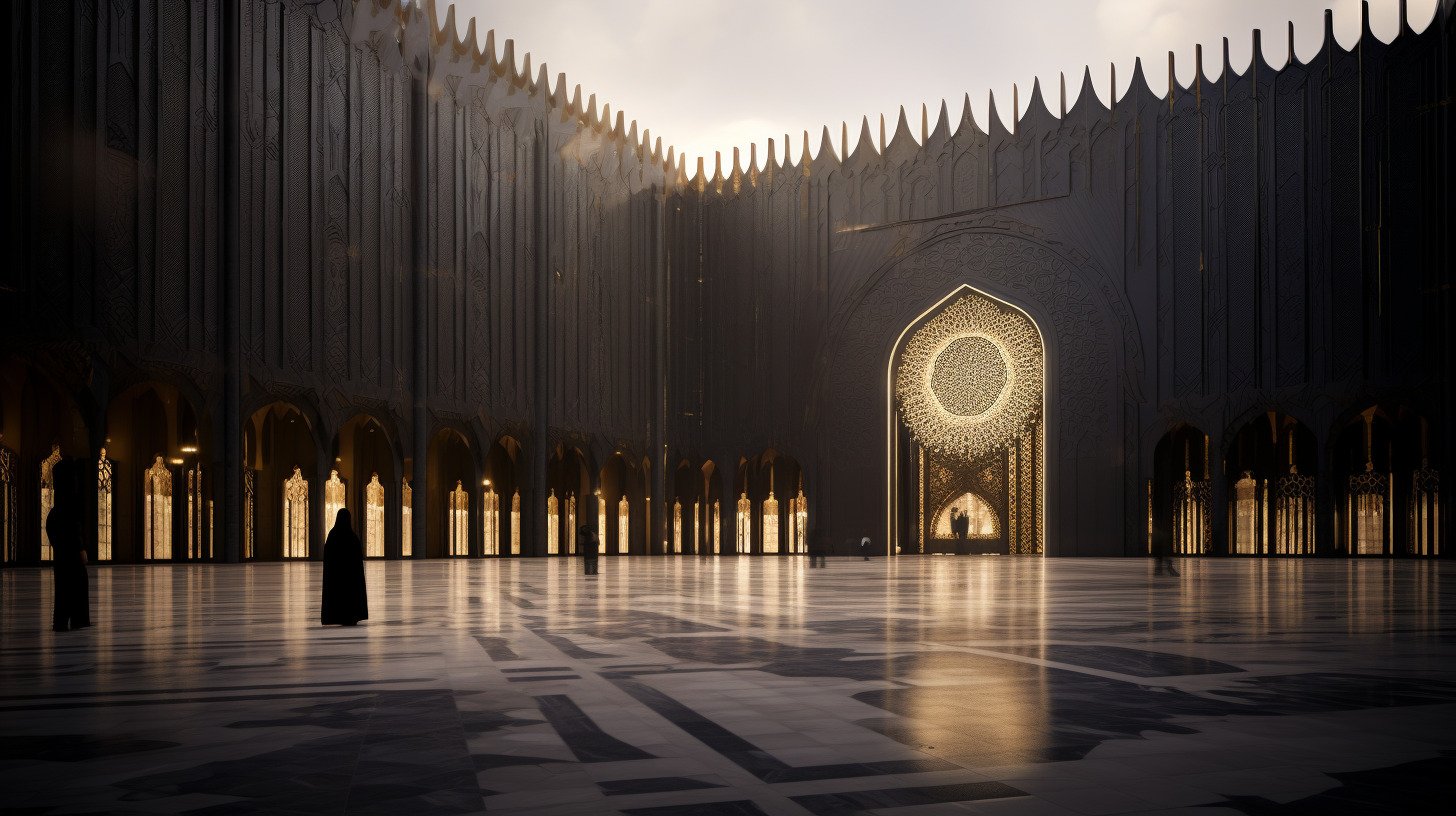
In the bustling heart of Lagos, a unique mosque emerges, melding the city's modern architectural spirit with Nigeria's deep-rooted cultural essence. More than just a place of worship, this structure stands as a testament to the harmonious interplay between contemporary design and traditional mosque architecture.
Its striking deep-hued facade, influenced by both modern aesthetics and Nigeria's architectural heritage, punctuates Lagos's skyline. Graceful minarets and a symbolic dome, echoing grand mosques of old, showcase the timeless principles of Islamic design. Ethically sourced wooden elements at the entrance, handcrafted by local artisans, reflect Nigeria's rich biodiversity and craftsmanship. These, alongside the mosque's mihrab, bridge the gap between Lagos's urbanity and the spiritual heart of Islam.
The entrance's golden door, detailed with patterns inspired by Nigerian artistry, transcends mere functionality—it's a gateway to faith and tradition. Figures by this door symbolize the community's keepers of knowledge, ensuring the mosque's role as a cultural and spiritual anchor in Lagos.
Within, the prayer hall exudes serenity, with ornate calligraphy and light filtering through geometric screens, creating an ambiance of reflection. This mosque, in its design and essence, celebrates Nigeria's diverse heritage, intertwining historical reverence with modern architectural flair.
Architect: John Beckmann
Design Team: John Beckmann, with Catherine Readick
© Axis Mundi Design LLC

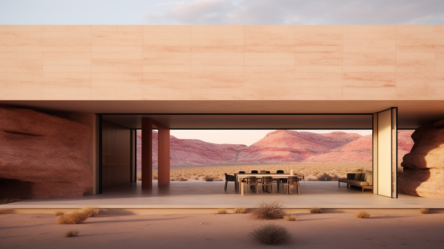
MonoHouse
MonoHouse
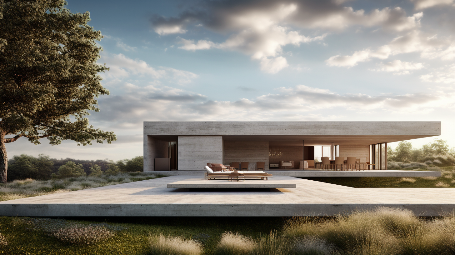
Concrete House
Forthcoming
Architect: John Beckmann
Total Area: 4000 sf
© Axis Mundi Design LLC

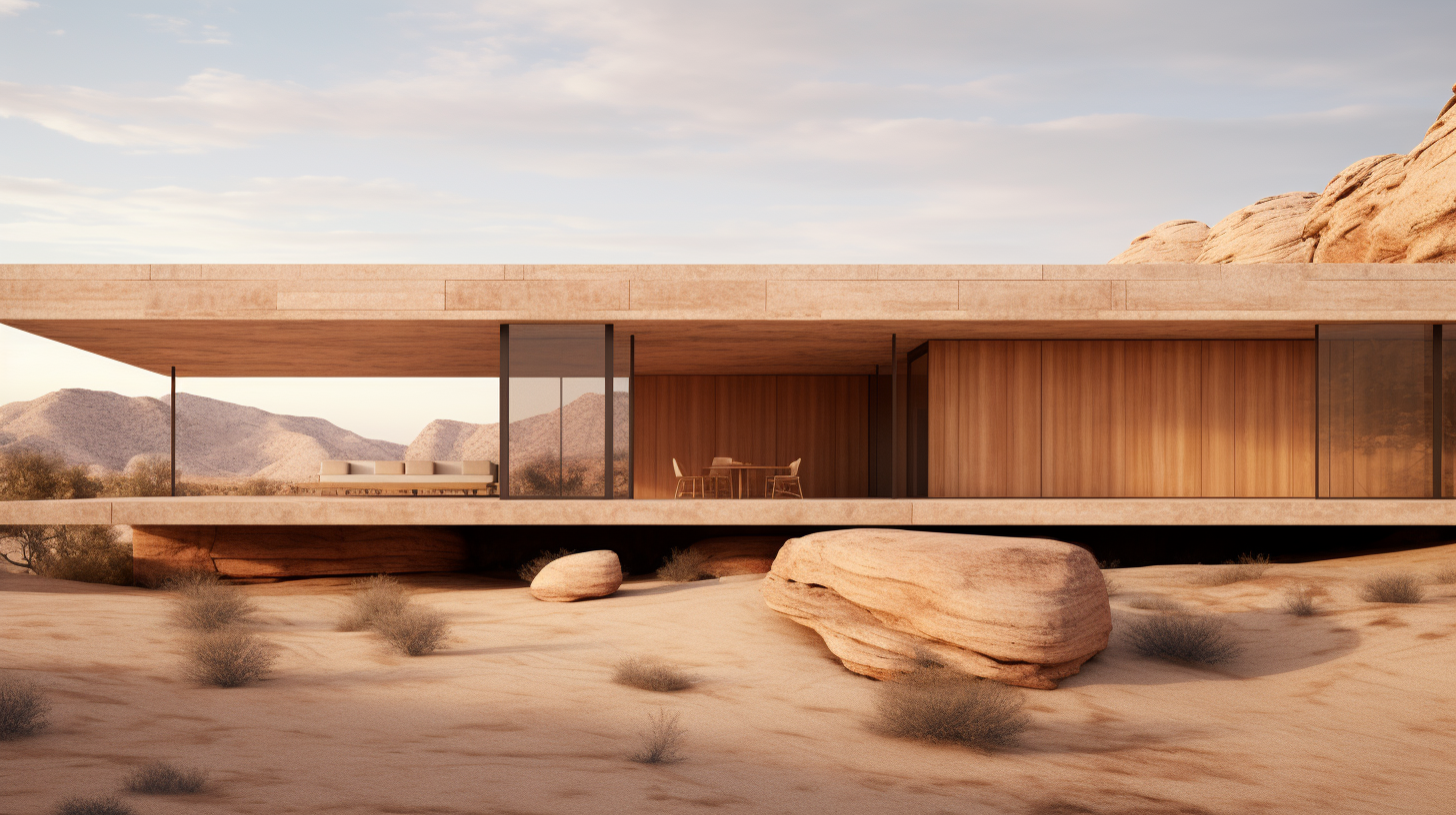
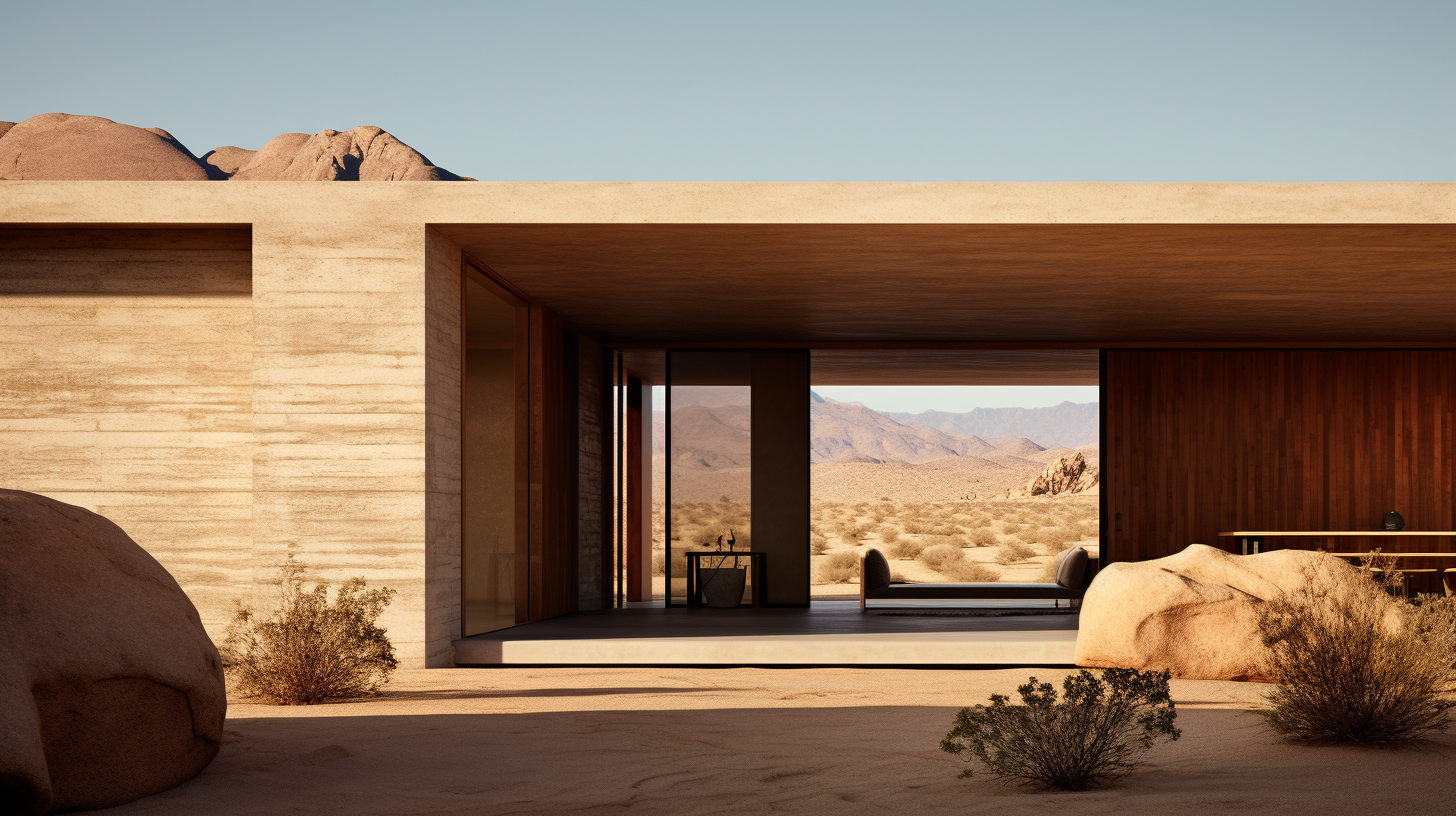
Joshua Tree
Joshua Tree
House in Joshua Tree
Forthcoming
Architect: John Beckmann
Total Area: 4000 sf
© Axis Mundi Design LLC

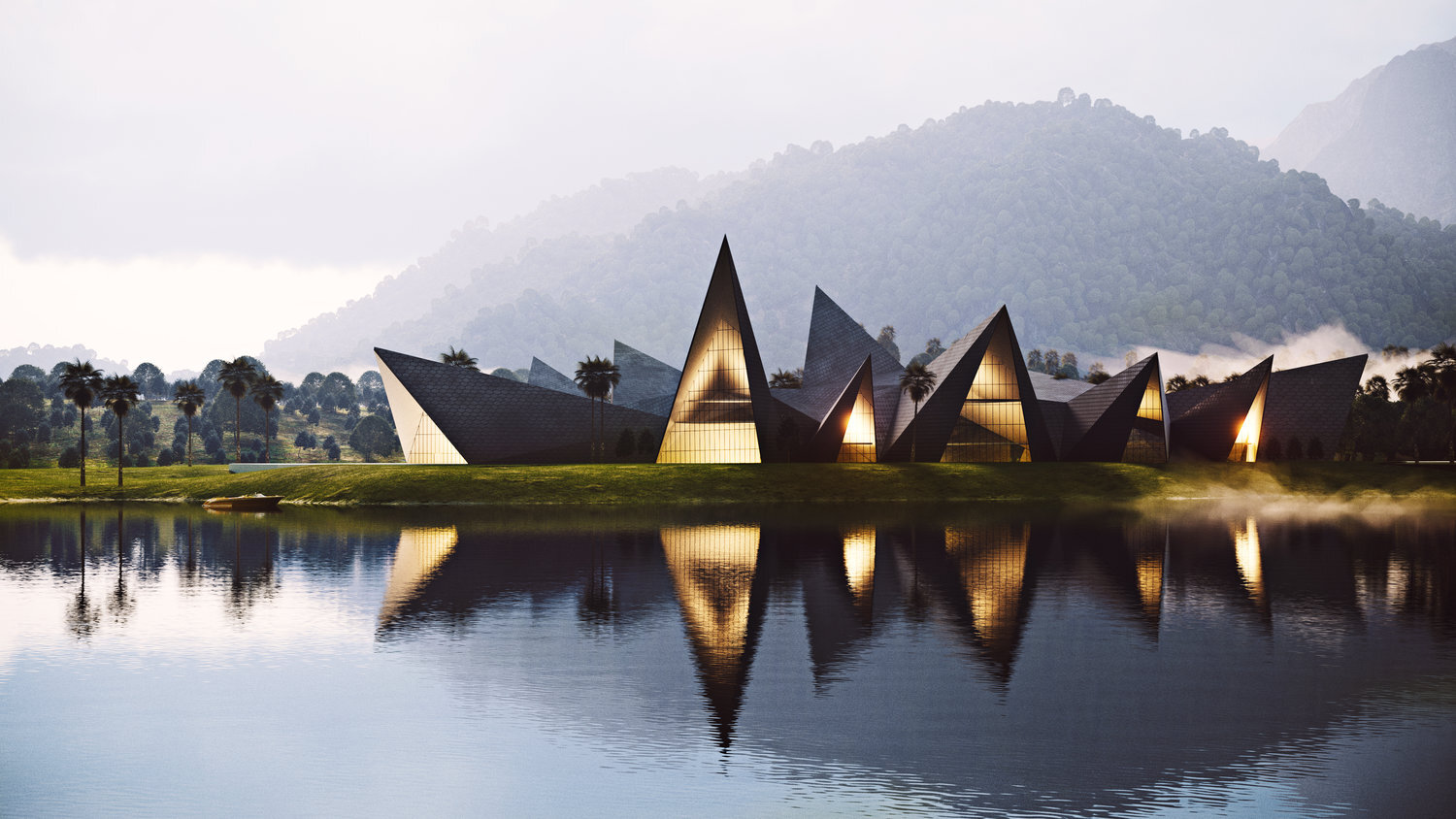
Lockheed Martin X Lab
We are defined not by the technologies we create, but the process in which we create them
- Kelly Johnson, Founder of Skunk Works
No mission is impossible. The X Lab is a stealth research facility for Lockheed Martin Skunk Works. Their charter is to create game-changing foundational technologies that inspire, protect and connect our world. Founded in Palo Alto, California in 1956, Lockheed Martin helped seed what would become Silicon Valley. They continue to evolve and lead the way in new realms, like lasers, nano-materials and informatics.
Set on a lush campus like setting of 25 acres, the buildings oddly shaped design resembles the wings of air planes and the faceted skins of newly developing jet fighters. The building looks like it’s going to take off at any moment. It is referred to as “the stegosaurus” by insiders, because if it’s spiky exterior. The main circulation spine is a zigzagging atrium that meanders through and connects all of the various work spaces, lecture halls, classrooms, and research labs in a non-hierarchical way, thus encouraging the exchange of ideas between the various working teams. The entire roof is clad in octagonal shaped photovoltaic tiles that were specially designed for the building.
“We are defined not by the technologies we create, but the process in which we create them”
- Kelly Johnson, Founder of Skunk Works
Lockheed Martin X Lab (Advanced Technology Center)
Palo Alto, California
No mission is impossible. The X Lab is a stealth research facility for Lockheed Martin Skunk Works. Their charter is to create game-changing foundational technologies that inspire, protect and connect our world. Founded in Palo Alto, California in 1956, Lockheed Martin helped seed what would become Silicon Valley. They continue to evolve and lead the way in new realms, like lasers, nano-materials and informatics.
Set on a lush campus like setting of 25 acres, the buildings oddly shaped design resembles the wings of air planes and the faceted skins of newly developing jet fighters. The building looks like it’s going to take off at any moment. It is referred to as “the stegosaurus” by insiders, because if it’s spiky exterior. The main circulation spine is a zigzagging atrium that meanders through and connects all of the various work spaces, lecture halls, classrooms, and research labs in a non-hierarchical way, thus encouraging the exchange of ideas between the various working teams. The entire roof is clad in octagonal shaped photovoltaic tiles that were specially designed for the building.
Architect: John Beckmann
Design Team: John Beckmann, with Luna Huang and Hannah LaSota
Visualization: 3DS
Total Area: 270,000 sf. Major Materials: Steel and concrete structure, and glass.
© Axis Mundi Design LLC

Whitney Downtown
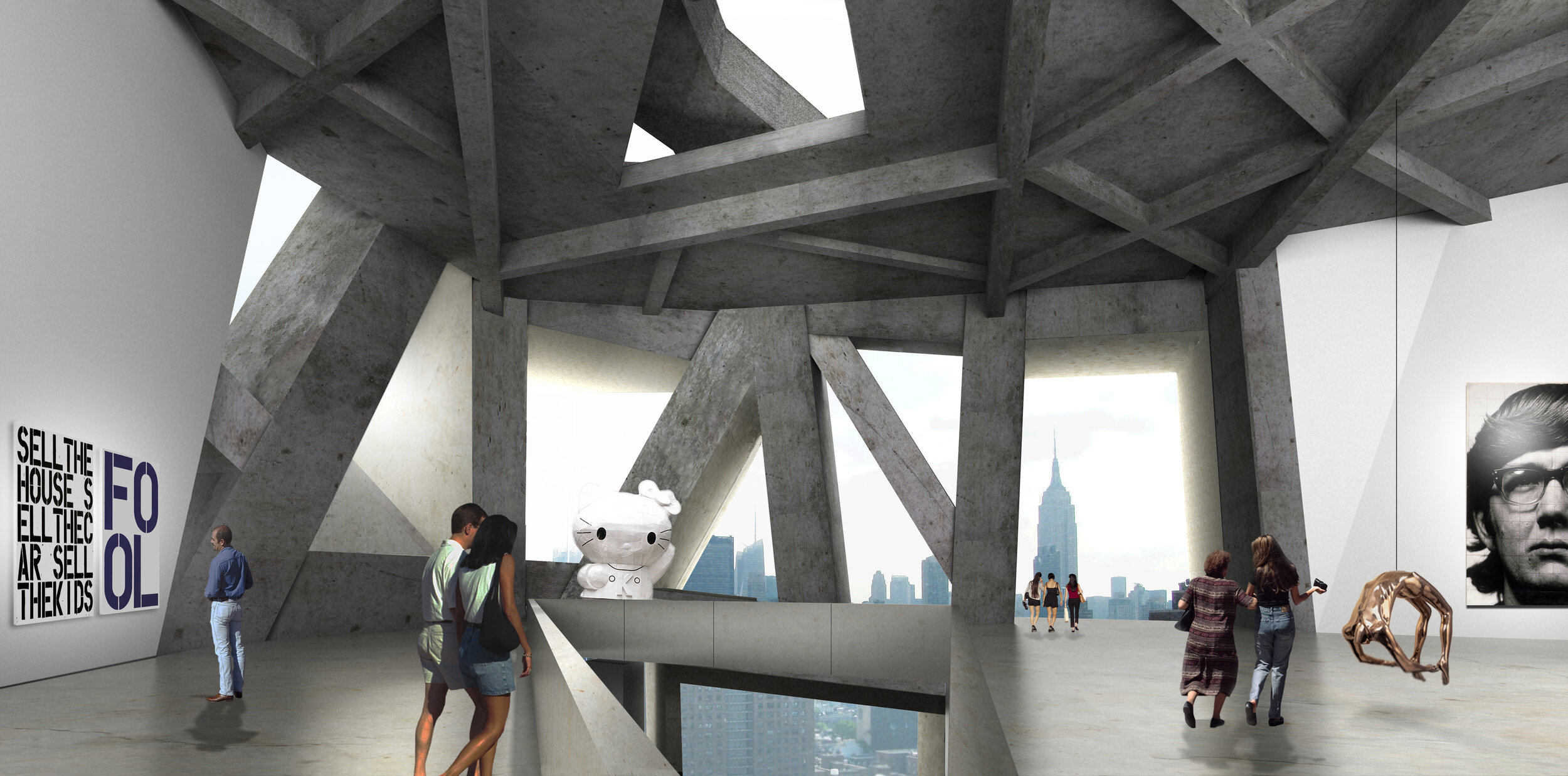
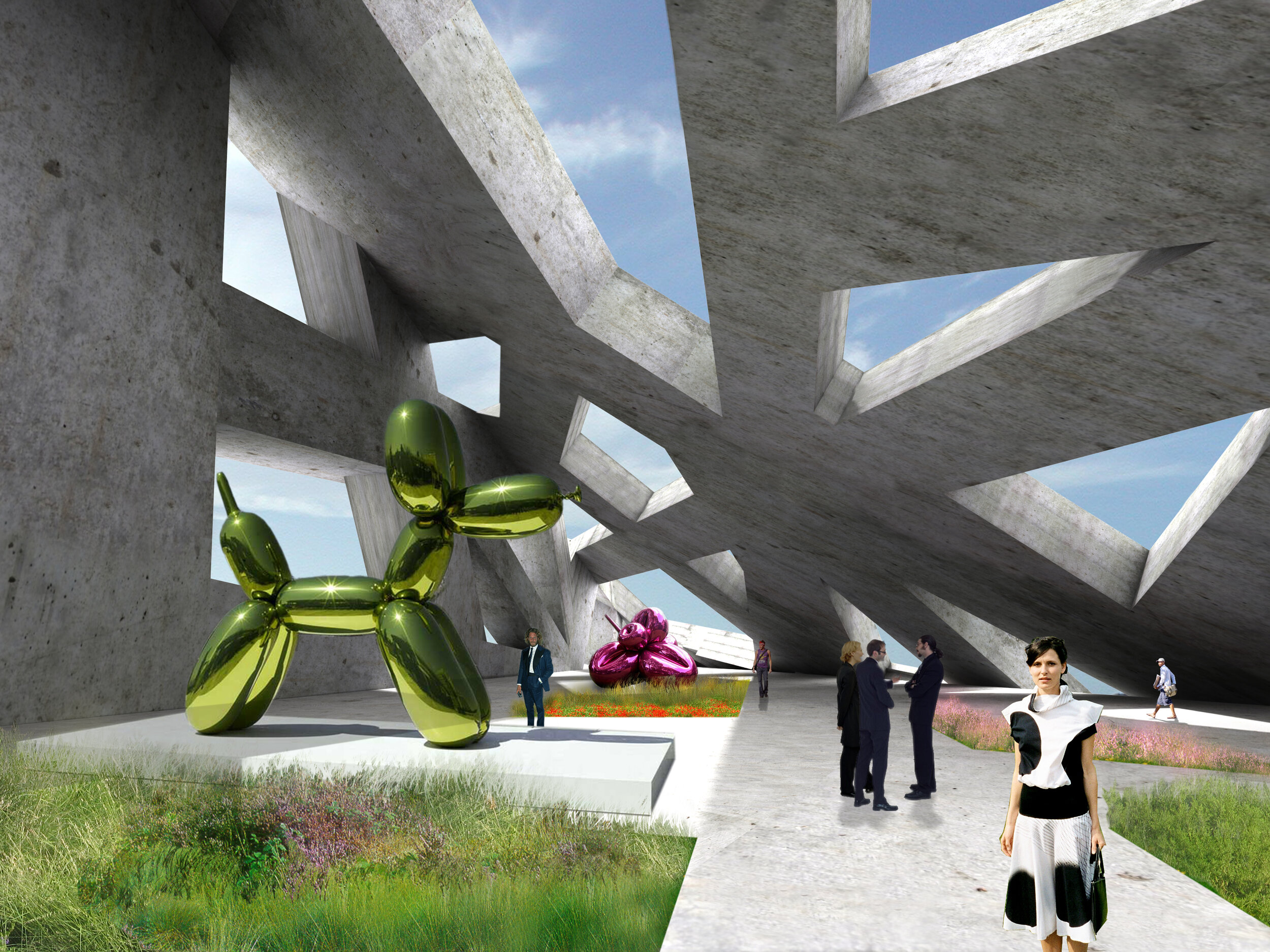
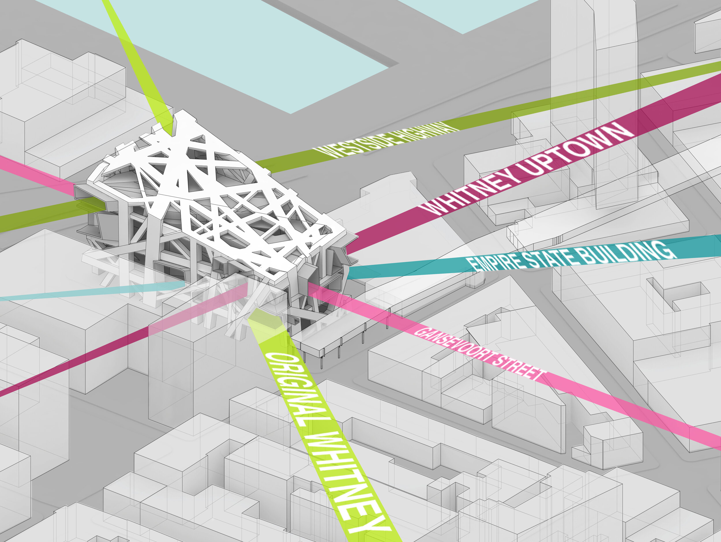
Why shouldn’t a museum building be as inspired and exciting as the art it holds? Why are we perpetually conceiving them as collections of white boxes locked within a grid structure? Axis Mundi breaks free of this form with its self-initiated proposal for the Whitney Downtown, experimenting—like all good art—with a more creative and challenging design. A dramatically irregular superstructure constitutes a perimeter lattice that conceals staircases, escalators, elevators and mechanical rooms. Column-free glass galleries are suspended like bridges from this lattice. In this way, the building more closely mirrors the actual creative process.
Whitney Downtown Museum
New York
Why shouldn’t a museum building be as inspired and exciting as the art it holds? Why are we perpetually conceiving them as collections of white boxes locked within a grid structure? Axis Mundi breaks free of this form with its self-initiated proposal for the Whitney Downtown, experimenting—like all good art—with a more creative and challenging architectural design. A dramatically irregular superstructure constitutes a perimeter lattice that conceals staircases, escalators, elevators and mechanical rooms. Column-free glass galleries are suspended like bridges from this lattice. In this way, the building more closely mirrors the actual creative process. We can imagine the irregular superstructure as the chaotic consciousness of the artist, within which ideas (the galleries) arise spontaneously and float freely, eventually falling into some sort of order within the matrix of the mind and coming to fruition on canvas, video, in three-dimensional sculptural form and other infinitely original ways. As John Beckmann says, “We imagine the contemporary museum to be a dynamic environment—a space that is less a container and more of a conduit.”
Architect: John Beckmann
Design Team: John Beckmann, Andy Vann, Denise Pereira and Marielle Vargas
Visualizations: Viviane Liao and Andy Vann
Illustrations and Diagrams: Denise Pereira and Andy Vann
Size: 40,000 sq. ft.
© Axis Mundi Design LLC

Cathedral Fold
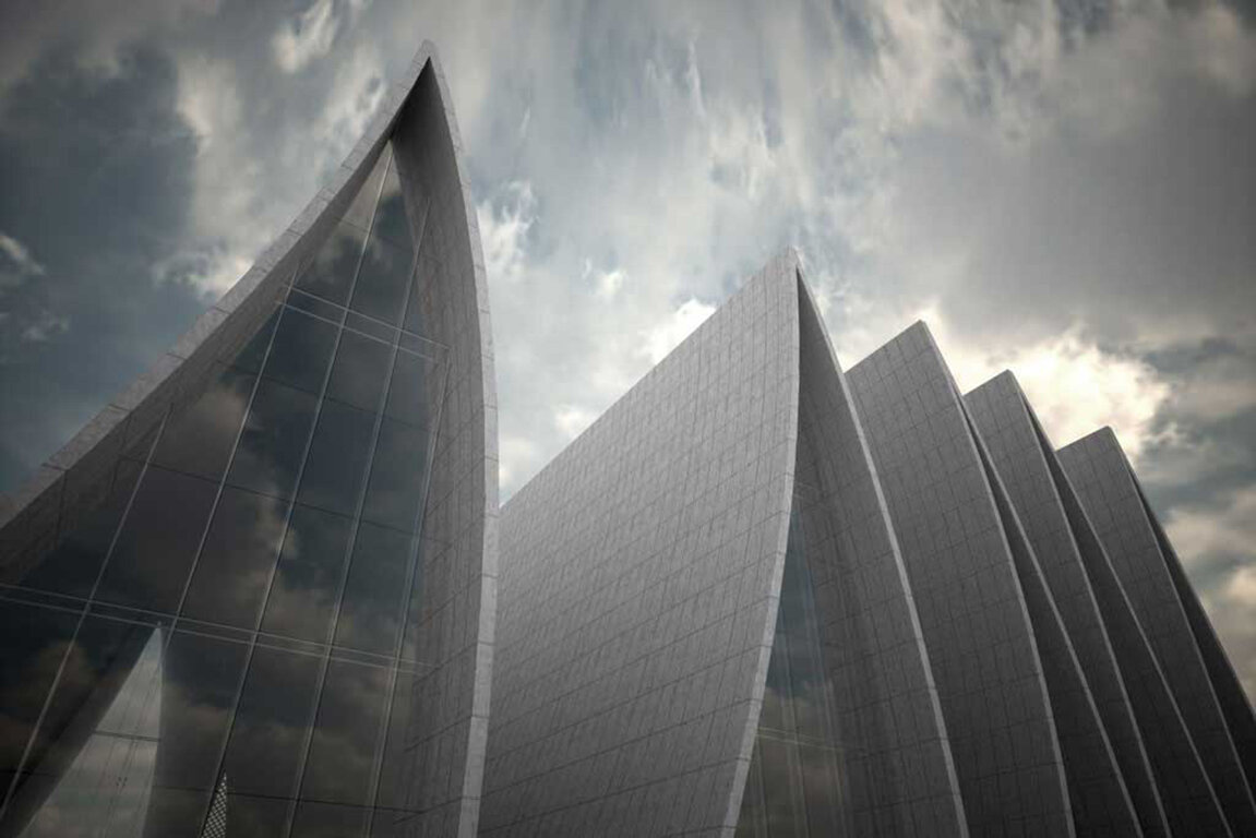
For the faithful, the centuries-old foundation of the world’s great religions is a powerful symbol. Staying vibrant, however, means also viewing that ancient tradition through a contemporary prism. That was the aim of Axis Mundi’s proposal for a new cathedral in Strasbourg, France. The foundation, submerged below ground, represents the Latin cross plan of historic cathedrals: a long nave intercepted by a transept. The façade also evokes Gothic cathedrals with a digitized bas relief depicting abstracted arches, towers and tracery that become more visible as the sun casts shadows on its limestone surface.
Cathedral Fold
Strasbourg, France
For the faithful, the centuries-old foundation of the world’s great religions is a powerful symbol. Staying vibrant, however, means also viewing that ancient tradition through a contemporary prism. That was the aim of Axis Mundi’s proposal for a new cathedral in Strasbourg, France. The foundation, submerged below ground, represents the Latin cross plan of historic cathedrals: a long nave intercepted by a transept. The façade also evokes Gothic cathedrals with a digitized bas relief depicting abstracted arches, towers and tracery that become more visible as the sun casts shadows on its limestone surface. Behind that façade, however, the familiar arches and groin vaults are replaced with a progression of slanted accordion folds conceived on the soaring scale of Europe’s famously inspiring basilicas. Glass walls between the folds invite in floods of glorious light, which come to rest on a dramatically minimalist altar and pulpit inspired by the basalt columns of Giants Causeway in Northern Ireland. Rising from it is a pure, unadorned bronze interpretation of Christianity’s most enduring emblem: the cross.
Architect: John Beckmann
Design Team: John Beckmann, Masaru Ogasawara and Viviane Liao
Visualizations and Diagrams: Viviane Liao and Masaru Ogasawara
Total Area: 25,000 sq. ft. Materials: Structurally reinforced concrete, limestone, seamed structural glass, bronze, and oak.
© Axis Mundi Design LLC

Mining Museum
World Museum of Mining. Butte, Montana
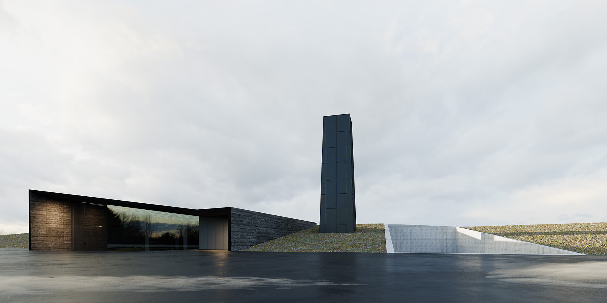
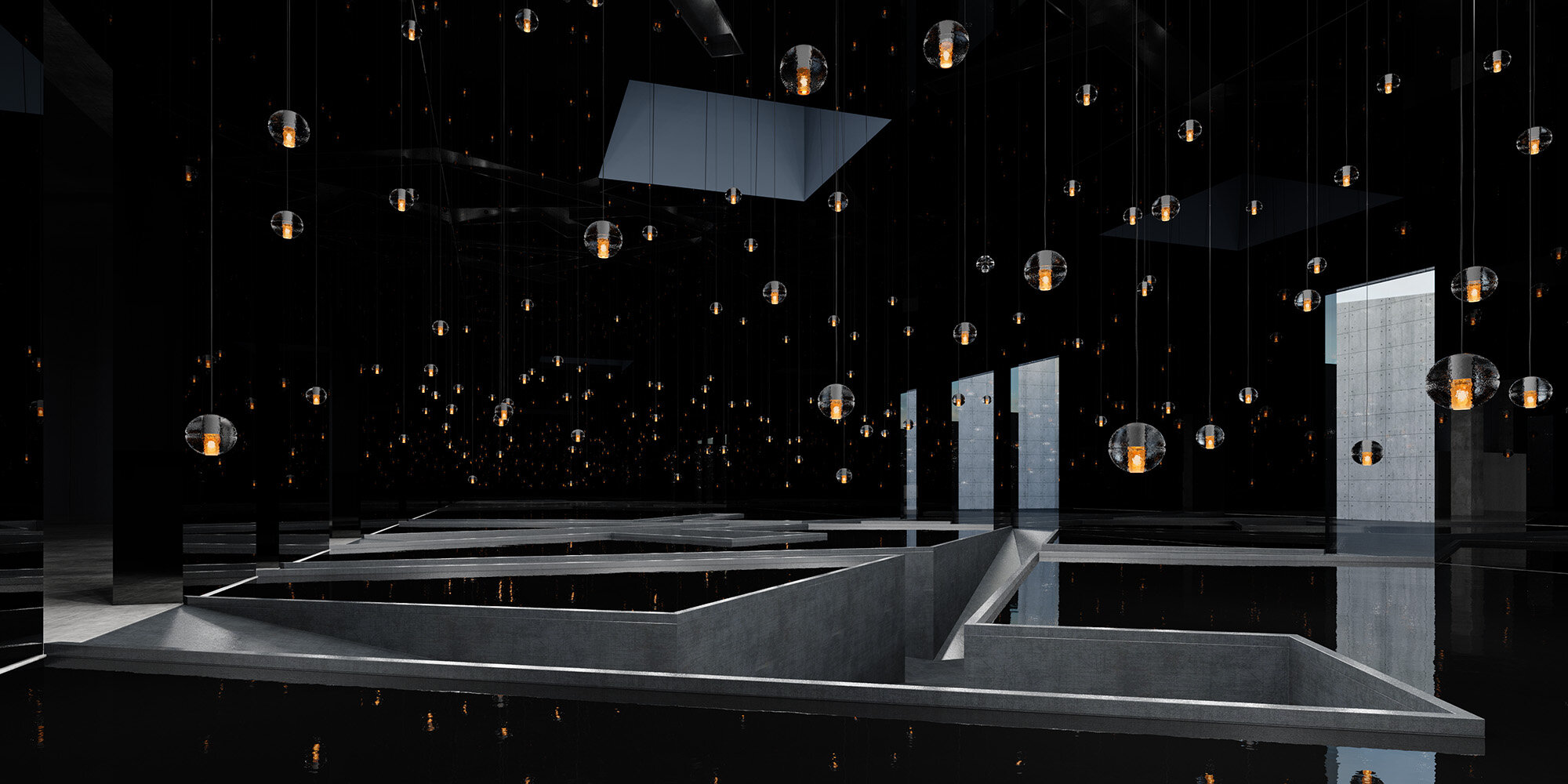
Mining is physically demanding task; it involves circulation and movement, expansion and compression, and demands the use of all senses. Poetically alluding to a journey through the mine, our proposal utilizes materials and textures, spatial sequencing, and lighting techniques to guide the visitor through an impactful sensorial experience.
Upon entering the main pavilion, the tapered ramp gradually narrows as the visitor descends through the first gallery and below grade into the cavernous lower exhibition space. Controlled light, along with immersive, educational exhibits and artifacts engage visitors as they wander among the tall columns of the gallery, imagining themselves the miner and the exhibited materials their precious discoveries. Labyrinthine walkways guide the visitor through the dimly lit vastness of the mirrored gallery, where the tall tower, signifying a head frame, provides a distant light, suggesting the visitor is deep below grade. Providing a stark contrast to the expansive, dimly lit exhibition space, the excavated exterior sculpture garden provides space for the community; the void in the earth honoring the many miner’s lost and the unforgotten portion of American history, which our design seeks to preserve and enrich.
“I imagined a labyrinth of labyrinths, a maze of mazes, a twisting, turning, ever-widening labyrinth that contained both past and future and somehow implied the stars “
— Jorge Luis Borges, Ficciones
World Museum of Mining
Butte, Montana
Mining is physically demanding task; it involves circulation and movement, expansion and compression, and demands the use of all the senses. Poetically alluding to a journey through the mine, our proposal utilizes materials and textures, spatial sequencing, and lighting techniques to guide the visitor through an impactful sensory experience.
Upon entering the main pavilion, the tapered ramp gradually narrows as the visitor descends through the first gallery and below grade into the cavernous lower exhibition space. Controlled light, along with immersive, educational exhibits and artifacts engage visitors as they wander among the tall columns of the gallery, imagining themselves the miner and the exhibited materials their precious discoveries. Labyrinthine walkways guide the visitor through the dimly lit vastness of the mirrored gallery, where the tall tower, signifying a head frame, provides a distant light, suggesting the visitor is deep below grade. Providing a stark contrast to the expansive, dimly lit exhibition space, the excavated exterior sculpture garden provides space for the community; the void in the earth honoring the many miner’s lost and the unforgotten portion of American history, which our design seeks to preserve and enrich.
Architect: John Beckmann
Design Team: John Beckmann, with Hannah LaSota, Alex Schweder and Darryl Scherba
Visualizations: Catalin Sandru
Diagrams: Hannah LaSota
Total Area: 16,000 sq. ft.
© Axis Mundi Design LLC

MoMA Tower
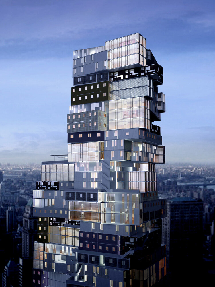
In a city as diverse as New York—where over 300 languages are spoken amongst countless cultures and nationalities—it’s puzzling to find skyscrapers formatted in cookie-cutter, one-style-fits-all fashion. This proposal presents a radically different conceptual alternative. Taking inspiration from randomly piled Brazilian favelas and Italian hill towns, the design offers a more accommodating flexibility for individual expression.
MoMA Tower
New York
In a city as diverse as New York—where over 300 languages are spoken amongst countless cultures and nationalities—it’s puzzling to find skyscrapers formatted in cookie-cutter, one-style-fits-all fashion. This proposal presents a radically different conceptual alternative. Taking inspiration from randomly piled Brazilian favelas and Italian hill towns, the design offers a more accommodating flexibility for individual expression. Unit modules of 800 to 2,000 square feet, called “SmartBlocks,” are assembled like pieces in a three-dimensional vertical puzzle around two cores that run the full height of double towers. Each SmartBlock has a different exterior treatment based on a handful of iconic architectural design styles, giving the irregularly stacked façade the appearance of a crazy-quilt vertical neighborhood. This alternative reframes the conversation around building tall while reflecting the heterogeneous reality of a great city. It represents a dynamic urbanism of difference, more visually alive than the glass-and-steel monotony of most city towers.
Architect: John Beckmann
Design Team: John Beckmann, CarloMaria Ciampoli, James Coleman (LAN), Nick Messerlian, Pauline Marie d’Avigneau, and Taina Pichon
Parametric Modeling: CarloMaria Ciampoli, James Coleman (LAN)
Visualizations: Orchid 3D
Illustration: Michael Wartella
Height: approx. 600 ft.
Floors: 50 above, 2 below
Building Footprint: 17,000 sq. ft.
MoMA Expansion Galleries: 32,500 sq. ft.
© Axis Mundi Design LLC

Ark House
For this residential proposal in Montana’s Madison Valley, Axis Mundi used a tried and true technique—taking design cues from rural buildings common to the landscape—but tweaked it by creating, in effect, a “barn with a view.” And a spectacular view it is. Bisecting the basic peaked form with a nearly 4,800-square-foot observation deck allows breathtaking outdoor viewing of Big Sky Mountain and Beaver Head National Forest.
Ark House
Madison Valley, Colorado
For this residential proposal in Montana’s Madison Valley, Axis Mundi used a tried and true technique—taking design cues from rural buildings common to the landscape—but tweaked it by creating, in effect, a “barn with a view.” And a spectacular view it is. Bisecting the basic peaked form with a nearly 4,800-square-foot observation deck allows breathtaking outdoor viewing of Big Sky Mountain and Beaver Head National Forest. The half that emerges from the bluff, which could also recall a covered bridge, serves as an entry pavilion. One can either step up to the observation deck from here or enter a 60-foot Cor-ten steel-and-glass bridge tucked under the stairs that overlooks a 3-story interior atrium and leads to the main living spaces in the other half of the structure. Underneath these are two floors of more private quarters. All rooms, however, have views: either out over the windswept valley or into the atrium. Geothermal heating and cooling, photovoltaic panels and high-performance building materials also ensure near-zero sustainability.
Total Area: 10,200 sq. ft. including 4,800 sq. ft. observation deck.
Architect: John Beckmann
Design Team: John Beckmann, Ronald Dapsis, Masaru Ogasawara and Natacha Mankowski
Visualizations: Ronald Dapsis and Masaru Ogasawara
Total Area: 10,200 sq. ft. including 4,800 sq. ft. observation deck.
Materials: Reclaimed oak siding and beams, Corten steel, glass, photovoltaic standing seam roof, CMU, steel sub-structure.
© Axis Mundi Design LLC

H2O Headquarters
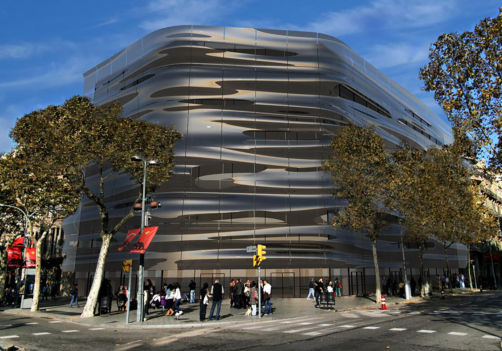
Axis Mundi eloquently captures the qualities of water—pristine, fluid, restlessly in motion—in its proposal for the Barcelona offices of H2O, a new bottled water company seeking to establish an innovative brand identity. The standard concrete structure of the existing building, just a stone’s throw from Gaudì’s masterpiece Casa Mila, is pierced with two elliptical voids that invite natural light into its core.
H2O
Barcelona, Spain
Axis Mundi eloquently captures the qualities of water—pristine, fluid, restlessly in motion—in its proposal for the Barcelona offices of H2O, a new bottled water company seeking to establish an innovative brand identity. The standard concrete structure of the existing building, just a stone’s throw from Gaudì’s masterpiece Casa Mila, is pierced with two elliptical voids that invite natural light into its core. An inventive brise-soleil, however, belies the building’s stationary mass and volume by mimicking the ripples of a pond. The team documented countless images of light on the flowing waters of rivers, streams and ponds, one of which was eventually made into 3D form using a phenolic composite material. This was cut and manipulated to create wave patterns that appear to ripple and rush impossibly around the building. This skin is suspended in front of the façade by organically shaped web trusses. “All water has perfect memory,” wrote author Toni Morrison, “and is forever trying to get back to where it was.” This exquisite building reminds us of the source from which we derive life.
Architect: John Beckmann
Design Team: John Beckmann, , Ronald Dapsis and Masaru Ogasawara
Visualizations and Diagrams: Ronald Dapsis
Size: 120,000 sq. ft."
© Axis Mundi Design LLC

Residences Athenee
A TEMPLE FOR THE .0001 PERCENT, THE WORLD’S MOST EXPENSIVE RESIDENCES TO RISE FROM THE ANCIENT PARTHENON.
Like a Phoenix rising from the ashes, the ancient Greek temple The Parthenon is being transformed into the world’s most expensive ultra-luxury residences. The planet’s most prestigious address is now on offer to the very highest echelons of the global super-elite, who have a once in a lifetime opportunity to enjoy a new rarefied standard of indulgence that puts the world’s 6 and 7 star hotels to shame.
Residents will luxuriate in breath-taking panoramic views over the Mediterranean, whilst the lavish facilities include multiple helipads, 24-hour private butler service, luxury car chauffeuring, and temperature-regulated storage for wine, furs, cigars and perfume. The air-conditioning in each apartment includes an oxygen enrichment system that allows residents to breathe in the luxury.
Residences Athénée
Athens, Greece
The World’s most Extraordinary Residences to rise from the Ancient Parthenon. Like a Phoenix rising from the ashes, the ancient Greek temple The Parthenon is being transformed into the world’s most expensive ultra-luxury residences. The planet’s most prestigious address is now on offer to the very highest echelons of the global super-elite, who have a once in a lifetime opportunity to enjoy a new rarefied standard of indulgence that puts the world’s 6 and 7 star hotels to shame.
Residents will luxuriate in breath-taking panoramic views over the Mediterranean, whilst the lavish facilities include multiple helipads, 24-hour private butler service, luxury car chauffeuring, and temperature-regulated storage for wine, furs, cigars and perfume. The air-conditioning in each apartment includes an oxygen enrichment system that allows residents to breathe in the luxury.
Opulent, hand-crafted interiors feature the materials of ancient Greece – marble and gold – as well as including fragments of classical art. The rock of the Acropolis has been excavated to create a magnificent underground health spa and gym. Seated majestically in this iconic location, the Residences Athénée provides the sumptuous stage set for a lifestyle that is unprecedented in human history.
Investors: Saudi Arabia Sovereign Wealth Fund
Architect: John Beckmann
Illustrations: Alyssa Egnew and Luna Huang
© Axis Mundi Design LLC

Polyhedra House
Axis Mundi’s proposal for this residence envisages a mammoth crystalline boulder protruding from the dramatic escarpment of the Palisades like a rock crystal emerging out of an implacable basalt matrix. Shooting vertiginously upward from the Hudson River and extending from Newark, New Jersey in the south to Nyack, New York in the north, this remarkable geological feature commands unparalleled views of Manhattan, the George Washington Bridge and the rolling hills abutting the river to the north.
Polyhedra House
Palisades, New Jersey
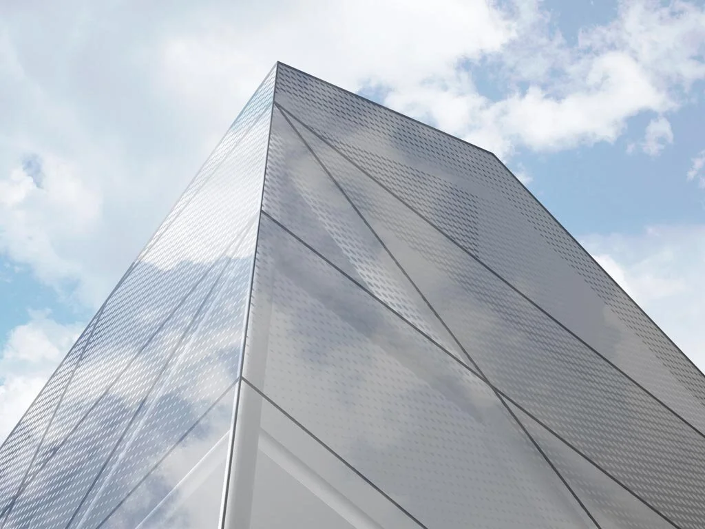
Axis Mundi’s proposal for this residence envisages a mammoth crystalline boulder protruding from the dramatic escarpment of the Palisades like a rock crystal emerging out of an implacable basalt matrix. Shooting vertiginously upward from the Hudson River and extending from Newark, New Jersey in the south to Nyack, New York in the north, this remarkable geological feature commands unparalleled views of Manhattan, the George Washington Bridge and the rolling hills abutting the river to the north. Beginning with a rectangular vertical shape drawn from the many viewing towers dotting the riverfront, the form is then pushed and pulled out in parts, resulting in what appears to be a bulbous, faceted outgrowth from the cliffs. These moves are dependent on desired framing of certain views, the sun’s path across the sky and topological considerations. The final form is a glass-sheathed polyhedron with main living spaces—kitchen, dining and living room—on the entry floor and bedrooms accessed by a floating stairway on the upper floors.
Architect: John Beckmann
Design Team: John Beckmann and Masaru Ogasawara
Visualizations: Masaru Ogasawara
Total Area: 4,000 sq. ft.
Materials: Concrete structure, anodized aluminum panels, seamed glass with solar reducing pattern, photovoltaic standing seam roof.
© Axis Mundi Design LLC

Vertical House
European gardens of the 18th and 19th centuries boasted architectural follies that mimicked Greek temple ruins, Chinese pagodas, Egyptian pyramids and other buildings. They were intended to make connections to the virtues of classical antiquity, travels to exotic lands and other evidence of one’s sophistication and breeding. This house adopts the idea intriguingly by excising pretense and frivolity to devise a unique solution to the steeply sloping topography of this site in Smuggler’s Nest, Vermont.
Vertical House
Smuggler's Nest, Vermont
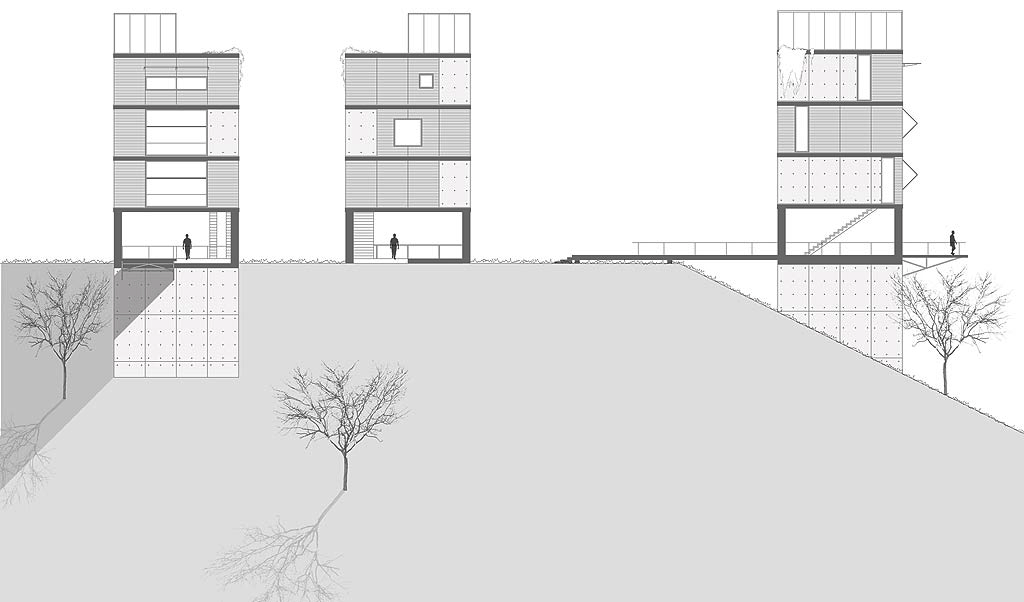
European gardens of the 18th and 19th centuries boasted architectural follies that mimicked Greek temple ruins, Chinese pagodas, Egyptian pyramids and other buildings. They were intended to make connections to the virtues of classical antiquity, travels to exotic lands and other evidence of one’s sophistication and breeding. This house adopts the idea intriguingly by excising pretense and frivolity to devise a unique solution to the steeply sloping topography of this site in Smuggler’s Nest, Vermont. An urban townhouse references a link between city and country living. A long bridge imparts a sense of procession and arrival, culminating in a cantilevered viewing platform. Stairs ascend to the kitchen and dining area, then to the second-floor living area, then to the master bedroom and bath. The roof’s open-air garden features striking 360-degree views of the land. As the house ages, vines descending from here will shroud the house in leafy cover, giving the structure the appearance of a modernist ruin—a large folly situated in an exceptionally large garden
Architect: John Beckmann
Visualizations: Diego Rosales
© Axis Mundi Design LLC

Chatham House
Modernism’s most sacred tenets—simplicity, utility, order, rationalism, form following function—were nothing new to the Shakers who settled New York’s Columbia County. This house, located in Chatham and not far from Hancock Shaker Village, therefore picks up on these parallel precedents to embrace both Shaker ideals and their natural outgrowth in the architecture of today.
Chatham House
Chatham, New York
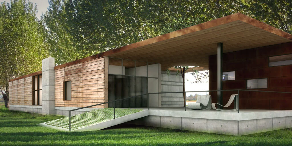
Modernism’s most sacred tenets—simplicity, utility, order, rationalism, form following function—were nothing new to the Shakers who settled New York’s Columbia County. This house, located in Chatham and not far from Hancock Shaker Village, therefore picks up on these parallel precedents to embrace both Shaker ideals and their natural outgrowth in the architecture of today. Here, a 16-foot entrance gallery lined with clerestory windows serves to separate principle living areas from bedrooms, while also functioning as exhibition space for a perpetually evolving collection of contemporary art and design objects. The house, raised on a concrete plinth, is clad in wood, while a separate studio showcases exterior surfaces covered in Cor-ten steel shingles. Yet the forms are unified by a continuous copper roofline. The interrelationship creates juxtapositions between urban and rural aesthetics, a sense of lofty volume grounded by humble materials and finishes, and an interplay between intimate rooms and the rolling wide-open landscape outside.
Architect: John Beckmann
Visualizations: Diego Rosales
© Axis Mundi Design LLC

Cape Cod Museum
The Cape Cod Museum of Art in Dennis, Massachusetts was established to preserve the artistic heritage of the area. Axis Mundi’s proposal for its design honors that heritage with a structure derived from the archetypal barn and shed forms ubiquitous throughout this picturesque peninsula. Yet rather than rely on straightforward imitation of these buildings, the design lays out several interconnected structures over a branching pattern, rooting them more firmly, if imperceptibly, to place by evoking the fractal geometries repeated throughout the natural landscape surrounding the site—trees, patterns of receding tides in the sand, plant roots and others.
The Cape Cod Museum of Art
Dennis, Massachusetts
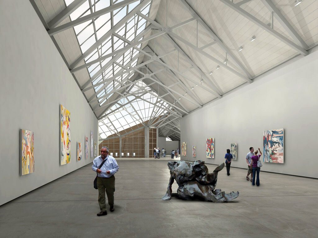
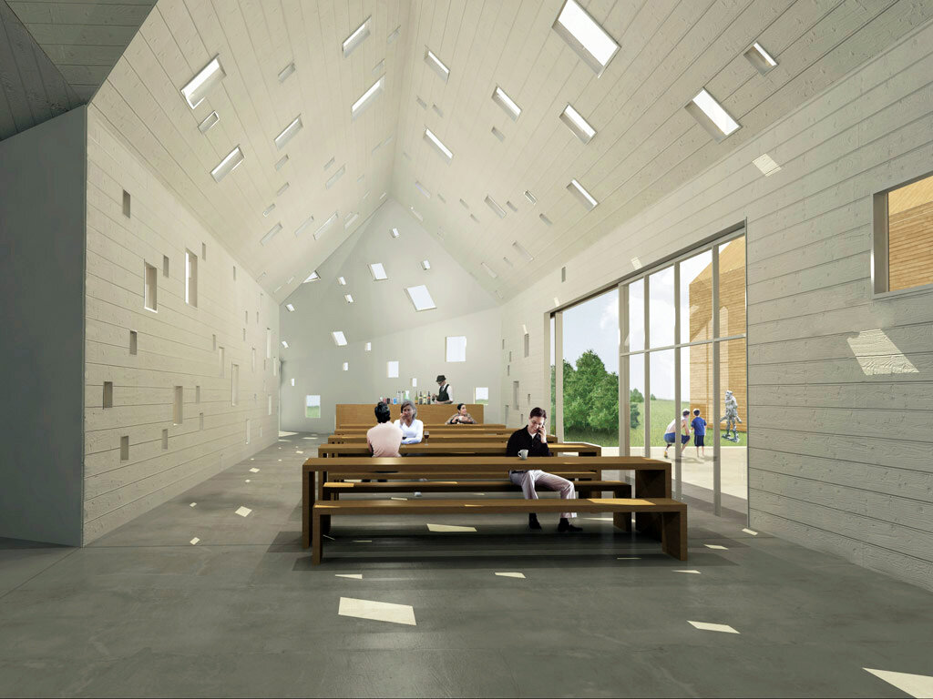
The Cape Cod Museum of Art in Dennis, Massachusetts was established to preserve the artistic heritage of the area. Axis Mundi’s proposal for its design honors that heritage with a structure derived from the archetypal barn and shed forms ubiquitous throughout this picturesque peninsula. Yet rather than rely on straightforward imitation of these buildings, the design lays out several interconnected structures over a branching pattern, rooting them more firmly, if imperceptibly, to place by evoking the fractal geometries repeated throughout the natural landscape surrounding the site—trees, patterns of receding tides in the sand, plant roots and others. Forming the spine of the museum, the galleries are lined with industrial skylights and structural steel half-trusses, allowing northern light to flood the exhibition spaces. The scale shifts to more intimate spaces in administration offices, restoration facilities and storage, a museum shop and café, and multipurpose/educational facilities. Non-profit institutional cost concerns are managed through economical industrial steel-shed construction, poured concrete, glass and untreated cedar siding.
Architect: John Beckmann
Design Team: John Beckmann, Marielle Vargas, Jon Polo, and Masaru Ogasawara
Visualizations and Diagrams: Marielle Vargas, Jon Polo, Masaru Ogasawara and Denise Pereira
Total: 27,500 sq. ft.
© Axis Mundi Design LLC

Pool Pavilion
Question: What is more luxurious than a view of the sea? Answer: A private view of the sea. This pool pavilion on the western coast of Quepos in Costa Rica achieves that level of luxury without imposing walls or gates. Instead, it builds toward it slowly and stealthily. Access to the view is not grand, just purposefully nondescript, offering a supremely unassuming gap in a wood-framed screen as an ambiguous point of entry.
Pool Pavilion
Quepos, Costa Rica
Question: What is more luxurious than a view of the sea? Answer: A private view of the sea. This pool pavilion on the western coast of Quepos in Costa Rica achieves that level of luxury without imposing walls or gates. Instead, it builds toward it slowly and stealthily. Access to the view is not grand, just purposefully nondescript, offering a supremely unassuming gap in a wood-framed screen as an ambiguous point of entry. Once in, however, we discover it conceals a lush secret garden to the left. On the right, a translucent glass wall further delays the main event. As we come around it and enter into a living-dining room with a small kitchen and bath, we see a pool bordered on two sides by the concrete exterior walls of the pavilion, its watery ripples disappearing over an infinity edge that directs the eye, finally, to one’s own personal perspective on the seascape beyond.
Architect: John Beckmann
Visualizations: Diego Rosales
© Axis Mundi Design LLC

