

Lucio
Step into Lucio and prepare to be dazzled by an artistic journey that's as bold as it is brilliant. Nestled in Milan's chic Corso Venezia, this bar is more than just a watering hole – it's a testament to the avant-garde genius of Lucio Fontana, Italy's post-war art maestro.
The moment you step through its doors, you're greeted by an atmosphere that oozes creativity and sophistication. Lucio's design, inspired by Fontana's iconic style, is nothing short of a masterpiece. Think hyperbolic-shaped vaults soaring overhead, draped in a vibrant red Venetian plaster that screams passion and creativity.
LUCIO
Step into Lucio and prepare to be dazzled by an artistic journey that's as bold as it is brilliant. Nestled in Milan's chic Corso Venezia, this bar is more than just a watering hole – it's a testament to the avant-garde genius of Lucio Fontana, Italy's post-war art maestro.
The moment you step through its doors, you're greeted by an atmosphere that oozes creativity and sophistication. Lucio's design, inspired by Fontana's iconic style, is nothing short of a masterpiece. Think hyperbolic-shaped vaults soaring overhead, draped in a vibrant red Venetian plaster that screams passion and creativity.
But Lucio isn't just about aesthetics; it's about the experience. Picture yourself sipping cocktails and savoring delectable bites in an ambiance that pulses with energy and drama. And here's the kicker – Lucio isn't just one bar; it's a bar within bars. Nestled within its intimate private areas are smaller bars, waiting to be discovered and savored.
In Lucio, Fontana's spirit lives on, inviting you to immerse yourself in a world where art and hospitality collide in the most spectacular fashion. So whether you're a seasoned art aficionado or just looking for a damn good drink, Lucio promises an experience that's truly one-of-a-kind. Cheers to creativity, innovation, and the enduring legacy of Lucio Fontana.
Design: John Beckmann, with Catherine Readick
Total Area: 4000 sf. ea.
© 2024 Axis Mundi Design LLC

NYC RestauraNt Sheds
NYC Shipping Container Restaurant Shed
NYC RestauraNt Sheds
NYC Shipping Container Restaurant Shed
Architects Envision Modular Concepts for Dining Out NYC
On August 18, 2022, Mayor Eric Adams announced that "With this initiative (Permanent Open Restaurants Program), we are also taking the essential step towards a permanent Open Restaurants program that all New Yorkers can be proud of every day," the mayor added. "I want to say it loud and clear: Outdoor dining is here to stay." Update: on August 16th, legislation was passed by Mayor Adams to make this program permanent.
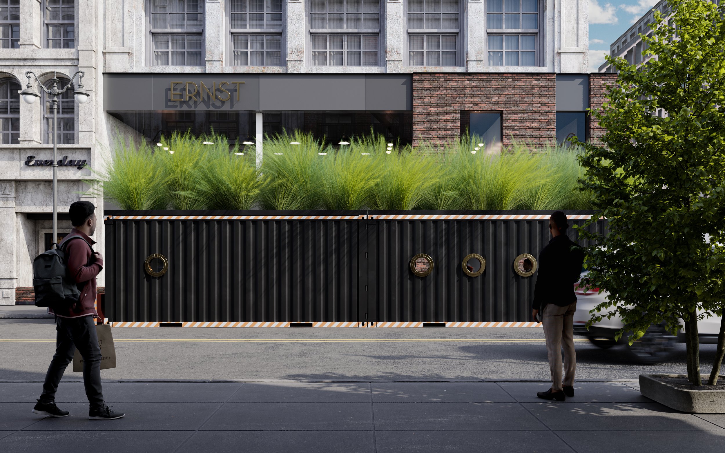
Axis Mundi proposes a design solution that will replace the hastily-built wooden eyesores that have lined the city streets for the past few years with both a design-forward and pragmatic vision. Shipping containers are the perfect size, readily available, and repurposable. The containers could be constructed in a modular louvered metal panel system (more Miesian in concept) and immediately customizable. The containers would accommodate a variety of configurations suitable for seasonal demands and privacy concerns," stated John Beckmann, the founder, and principal of Axis Mundi. Beckmann continues: "The shipping container reinforces the dining ethos with its substantial and well-traveled permanence, its strength with bespoke capability."
Positing the passenger train as a design model, Axis Mundi details two schemes: the dining car and the bar car. The rail cars suggest glamour in measured comfort and contained proportion. The design features a black and white checkerboard floor, round porthole windows framed by striped awnings, and Thonet chairs. It is cosmopolitan, stylish, and streamlined. The shipping container exterior with the luxury interior is unexpected and exciting as if it is hiding in plain sight. “We added a green roof of tall grass. The vegetation will reduce ambient street noise and regulate temperature below. It also playfully softens the hard lines.” says Beckmann. We see the container shelter as a ready-made object, as its design is complete. We anticipate numerous variations on the theme, as the shipping container permits customization befitting a restaurant's respective brand," Beckmann concluded.
Stay tuned for more details of the various exclusive modular systems we will be proposing for Dining Out NYC.
Click on this link for the latest updates:
https://www.diningoutnyc.info/
Design: John Beckmann, with Catherine Readick
Renderings: Kirill Lynkovsky
Total Area: 160 sf. ea.
© 2022 Axis Mundi Design LLC

Arthur Murray Studio
Arthur Murray Studio
Arthur Murray Dance Studio
Arthur Murray Studios celebrated more than 100 years of teaching dance at over 270 Arthur Murray Dance Studios in 22 countries across the globe. These range from studios in Australia (where the prestigious Crows Nest and Parramatta Dance Studios are located) and throughout North America, South America, Europe, and Asia.
Design: John Beckmann, with Catherine Readick
Renderings: Kirill Lynkovsky
Total Area: 2000 sf. ea.
© 2022 Axis Mundi Design LLC

Rubin Museum of Art
Synesthesia. Rubin Museum of Art.
Our design concept creates a dynamic and fluid immersive space which conveys a sense of boundlessness. The primary experience seeks to imbue the gallery goers with a sense of wonderment and awe, to elevate mindfulness via the integrated use of light and color and sound based experiences both of which can imperceptibly change throughout the course of museum hours.
“Whether this mysterious sanctuary hidden amid Pemako’s mist-shrouded mountains can ever be located geographically is of secondary importance to the journey itself. In the Buddhist tradition, the goal of pilgrimage is not so much to reach a particular destination as to awaken within oneself the qualities and energies of the sacred site, which ultimately lie within our own minds.”
― Ian Baker, The Heart of the World: A Journey to the Last Secret Place
SYNESTHESIA | Himalayan Vista
Concept
Our design concept creates a dynamic and fluid immersive space that conveys sheer boundlessness. The integrated use of light and color (wavelength) and sound-based experiences (vibration), both of which can imperceptibly change (phase shift) throughout the course of museum hours, serves not only to elevate mindfulness, but also to imbue gallery-goers with a sense of wonderment and awe.
Form
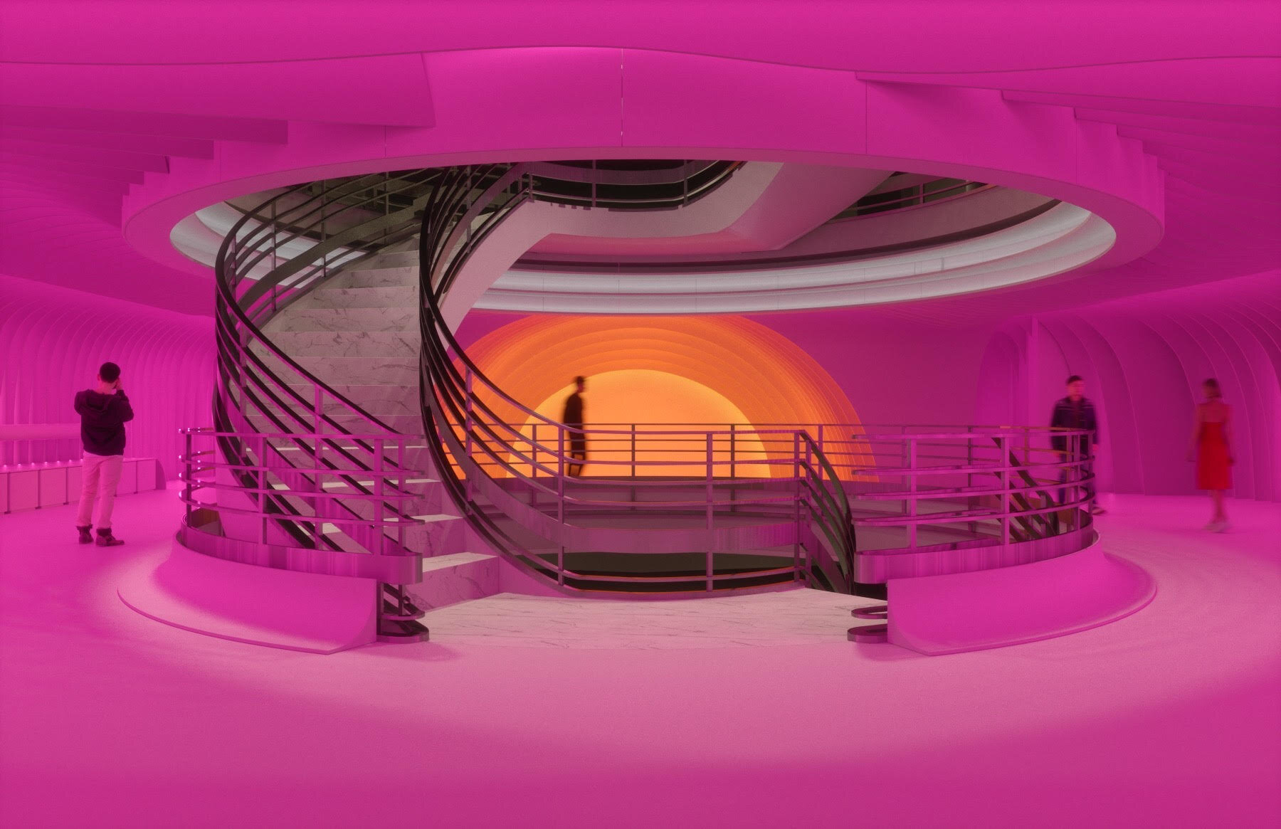
The interior form is inspired by a three-dimensional topographic map that has been conceptually removed from the third floor gallery - creating a presence of absence. To enable a unique flowing geometry, we’ve clad the walls and ceilings with a framework of lightweight, computer-milled acoustical ribs which are made from a mix of sustainable and recycled materials and impregnated with sound-absorbing felt. Felt has a long and storied history in Central Asia, and the merging of the latest digital fabrication techniques with this most ancient of materials enables us to echo what the late French philosopher Gilles Deleuze deemed “the smooth and the striated.”
Function
The design allows us to core the Main Gallery floor with a dramatic and spacious Amphitheater and Proscenium, suitable for both lectures and video presentations (rear wall = projection surface). The interior of the West Gallery features a long, integrated bench that conceals a collection of oversized ottomans and yoga mats. There’s an adjacent ‘low-tech interactive space’, as well as a highly-functional Education Center replete with prep counter, sink, adjustable shelves and two sides of hidden storage. In the southeast corner, we’ve designed an elliptically-shaped meditation space with a curved bench and crowned by a colored egg-shaped skylight.
Light + Color
The LED lighting is controlled on a timer system, which, once programmed, will allow for an infinite spectrum of color combinations. As illustrated in the renderings, the possibilities range from all white, slow gradient color fades, to striking rainbow-like effects.
In essence, the design creates an expansive numinous gateway; a space which is both functional and flexible. It will also allow many and varied opportunities to showcase stimulating artistic and educational experiences and ideas.
Video: https://vimeo.com/391340180
Concept + Design: John Beckmann
Design Team: John Beckmann, Kirill Lynkovsky, Sara Kostić and Linda Jopen
©2020 Axis Mundi Design LLC

Lux Astralis
Lux Astralis, New York
Lux Astralis is an exclusive, high-end tequila bar based on the typical 25’x100’ lot size in New York City. Inspired by the infinity rooms by artist Yayoi Kusama, the ceiling, walls and floors of the main bar area are clad in mirror and black marble, reflecting the soft light of the Bocci pendants. Featuring a long bar of glowing backlit onyx and small tables, divided by elegant brass dividers, guests are welcomed to sample their tequilla in this glamorous, celestial atmosphere.
Lux Astralis, New York
Lux Astralis is an exclusive, high-end tequila bar based on the typical 25’x100’ lot size in New York City. Inspired by the infinity rooms by artist Yayoi Kusama, the ceiling, walls and floors of the main bar area are clad in mirror and black marble, reflecting the amber glow of the Bocci pendants. Featuring a long bar of glowing backlit gold onyx and small tables, divided by elegant burnished brass dividers, guests are welcomed to sample an extraordinary samplings of tequila in this celestial atmosphere.
The journey continues to the Lounge, which provides an additional luxurious environment. Fitted with low slung red velvet sofas, David Hicks inspired patterns, and a 19th century fantasy-scape mural, the Lounge offers an imaginative and enchanting environment for both intimate and exclusive events.
Design: John Beckmann, with Hannah LaSota
Renderings: 3DRS
Total Area: 2500 sq.ft.
© Axis Mundi Design LLC 2019

Finsight Group
Finsight Corporate Headquarters
530 Seventh Avenue, 27th Floor
New York, 10018
IN PROGRESS
Design: John Beckmann
Design Team: John Beckmann, with Rowena Karmy
Visualizations: Kirill Lynkovsky
Total Area: 9000 sf
Built: 1930 Buchman & Kahn Architects
© Axis Mundi Design LLC 2020
Finsight Group
Finsight Corporate Headquarters
530 Seventh Avenue, 27th Floor
New York, 10018
IN PROGRESS
Design: John Beckmann
Design Team: John Beckmann, with Rowena Karmy
Visualizations: Kirill Lynkovsky
Total Area: 9000 sf
Built: 1930 Buchman & Kahn Architects
© Axis Mundi Design LLC 2020
Finsight Group Headquarters
530 Seventh Avenue, 27th Floor
New York
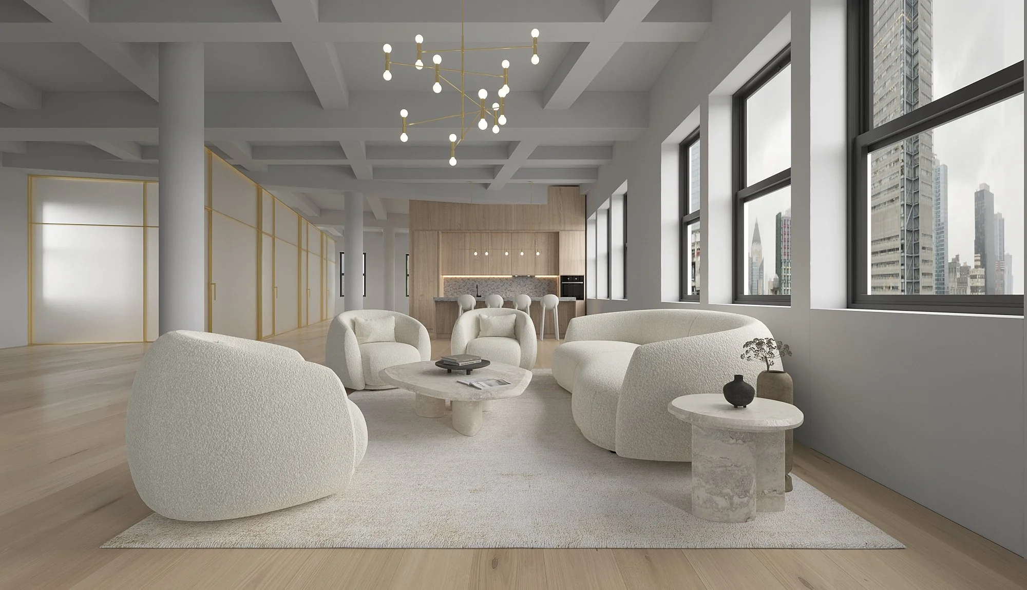
FINSIGHT's Manhattan Office: Precision Without Pretense
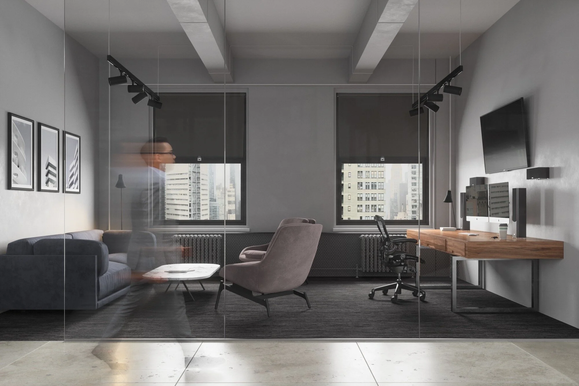
FINSIGHT, the New York-based financial technology firm trusted by thousands of institutional investors and global banks, doesn’t deal in noise. Their new 9,000-square-foot office reflects that. Located in Manhattan, the space is defined by restraint—an open plan, a limited palette, and one very deliberate architectural feature: a central spine that organizes the floor without interrupting flow.
The design avoids tech clichés. There are no swings, no exposed ducts painted in ironic colors. Instead, the materials are honest—steel, concrete, glass—selected not to soften the space but to clarify it. Light floods in through full-height windows and is met by matte surfaces that absorb rather than boast.
The color scheme is a study in neutrality: soft grays, graphite, and bone. Color, where used, serves as signal—never decoration. Furnishings are tailored for use, not effect. Workstations are uniform and quietly ergonomic. Meeting rooms are enclosed in clear glass, transparent but dignified.
At the center of the space is its most distinctive feature: a sculptural partition that serves as both a threshold and an anchor. It draws a subtle boundary between individual focus and collaborative flow. Not quite a wall, not quite art, it sets the tone: precise, nonverbal, architectural.
Acoustics are controlled invisibly, with overhead panels that vanish into the ceiling. The result is an office tuned for attention—no buzz, no echo, no wasted motion.
FINSIGHT creates tools that provide visibility and insight into volatile markets. Their office does the same: a space that offers clarity without spectacle. A design that earns your trust by not trying to.
Design: John Beckmann and Sara Kostic
Visualizations: Kirill Lynkovsky
Total Area: 9000 sf
Built: 1930, Buchman & Kahn Architects
© Axis Mundi Design LLC 2020

TAG
TAG Headquarters, 530 Seventh Avenue, 23th Floor, New York, 10018
IN PROGRESS
Design: John Beckmann
Design Team: John Beckmann, with Rowena Karmy
Visualizations: Kirill Lynkovsky
Total Area: 9000 sf
Built: 1930 Buchman & Kahn Architects
© Axis Mundi Design LLC 2021
TAG
TAG Headquarters, 530 Seventh Avenue, 23th Floor, New York, 10018
IN PROGRESS
Design: John Beckmann
Design Team: John Beckmann, with Rowena Karmy
Visualizations: Kirill Lynkovsky
Total Area: 9000 sf
Built: 1930 Buchman & Kahn Architects
© Axis Mundi Design LLC 2021
TAG Headquarters NYC
530 Seventh Avenue, 23th Floor
New York,
TAG AMERICAS COLLABORATION HUB
Tag Collaboration Hub, located in New York, serves as the headquarters for Tag Americas.
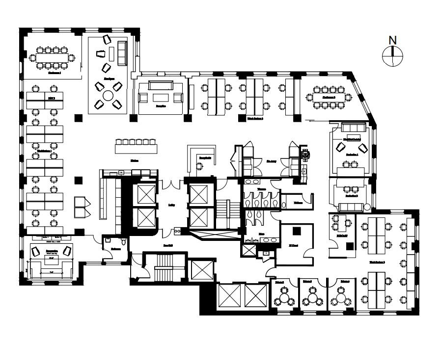
The Tag Collaboration Hub was designed as an adaptive, inclusive environment—a physical manifestation of a mobile, collaborative, creative culture. It's not simply a workspace; it’s a social architecture for high-functioning interactions. Designed to feel less like a corporate back office and more like a must-visit New York locale, the Hub rejects permanence in favor of possibility.
Here, design does not signal hierarchy—it choreographs interaction. Every surface, texture, and threshold was selected to support the ephemeral nature of hybrid work. No assigned desks. No territorial clutter. Employees book space through a dedicated app, arrive with purpose, and leave without a trace. Personal items are stored temporarily, never anchored.
The feeling is not institutional. It’s closer to the charge of a long-overdue family gathering—familiar, electric, alive. The architecture doesn’t overstate itself. It frames. It cues. It invites. The result is a space that moves with its people, sparking innovation and leaving clients with the sense that something vital just happened.
https://www.tagww.com/
Design: John Beckmann and Sara Kostic
Visualizations: Kirill Lynkovsky
Total Area: 12,000 sf
Built: 1930, Buchman & Kahn Architects
© Axis Mundi Design LLC 2021

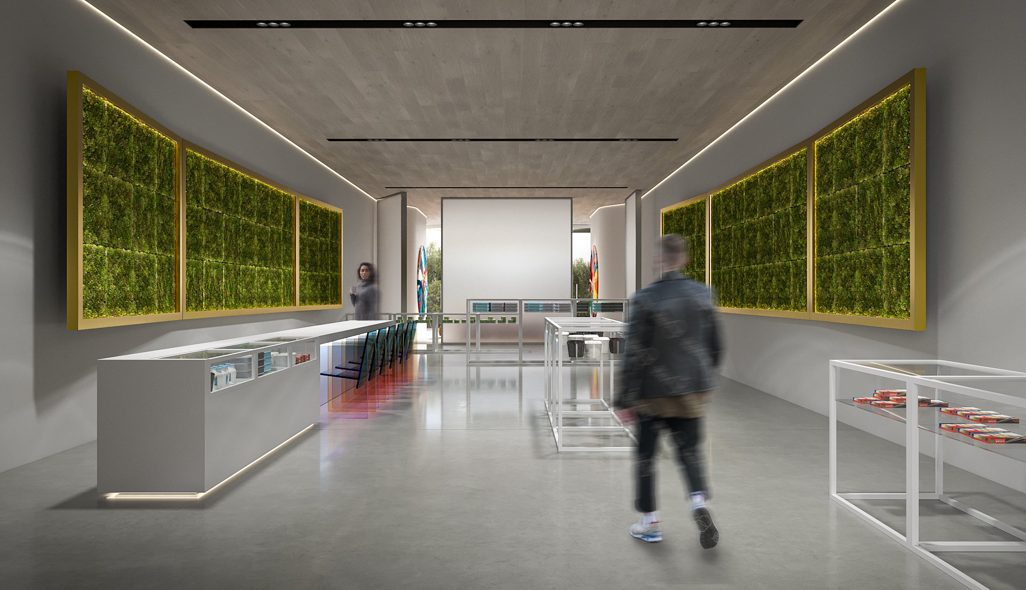
CBD Shop + Gallery
CBD Shop and Gallery
Smoke shop design ideas New York
CBD Shop + Gallery
CBD Shop and Gallery
Smoke shop design ideas New York
CBD Shop + Gallery, New York
Design: John Beckmann
Renderings: Kirill Lynkovsky
Total Area: 3125 sq.ft.
© Axis Mundi Design LLC 2021

Pico Clinic Med Spa
Pico Clinic Med Spa
Flatiron
Pico Clinic Med Spa
Pico Clinic Med Spa
Flatiron
Pico Clinics Med Spa
821 Broadway, 7th Floor
New York
With locations is Milan, London, Barcelona, and five branches in China, Pico Clinics offers the latest in aesthetic treatments. This is their flagship center in New York’s Flatiron District.
Design Team: John Beckmann
Total Area: 3000 sq.ft.
© Axis Mundi Design LLC 2021

Yogasmoga Stores
Yogasmoga, Various Locations
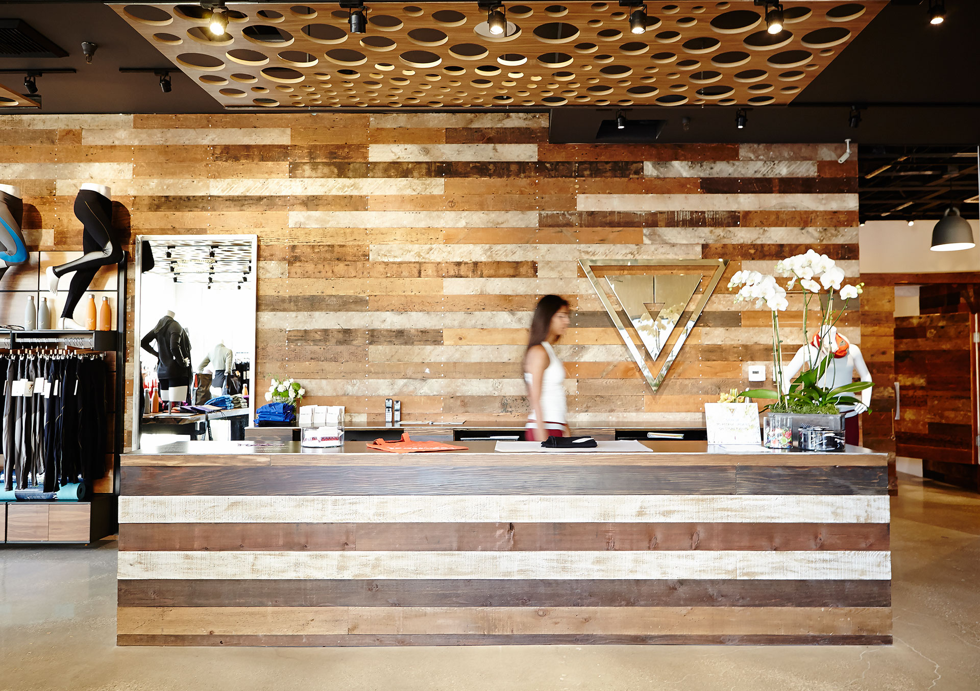
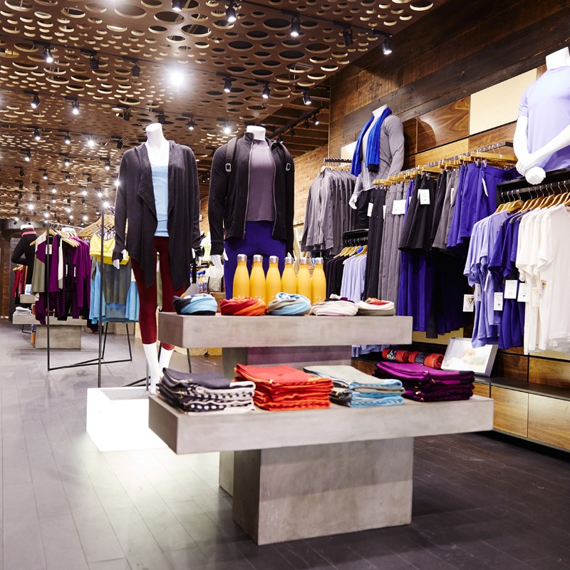
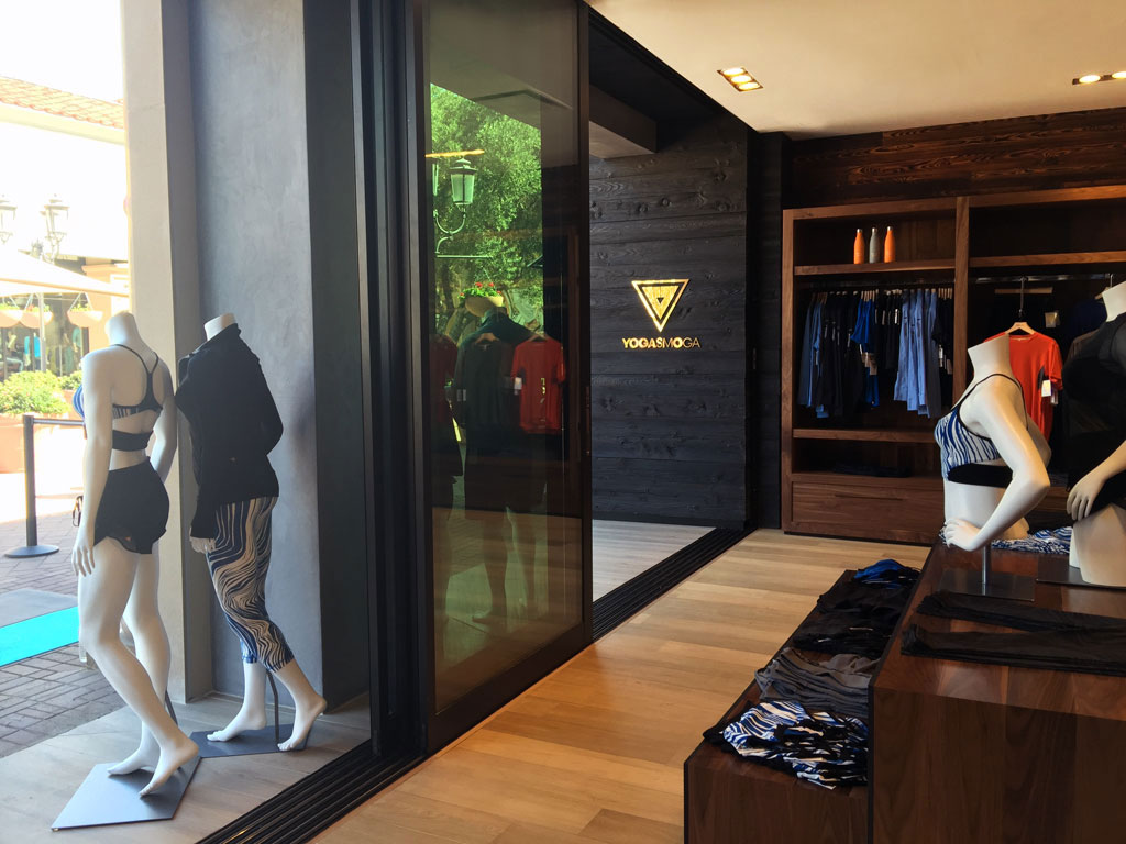
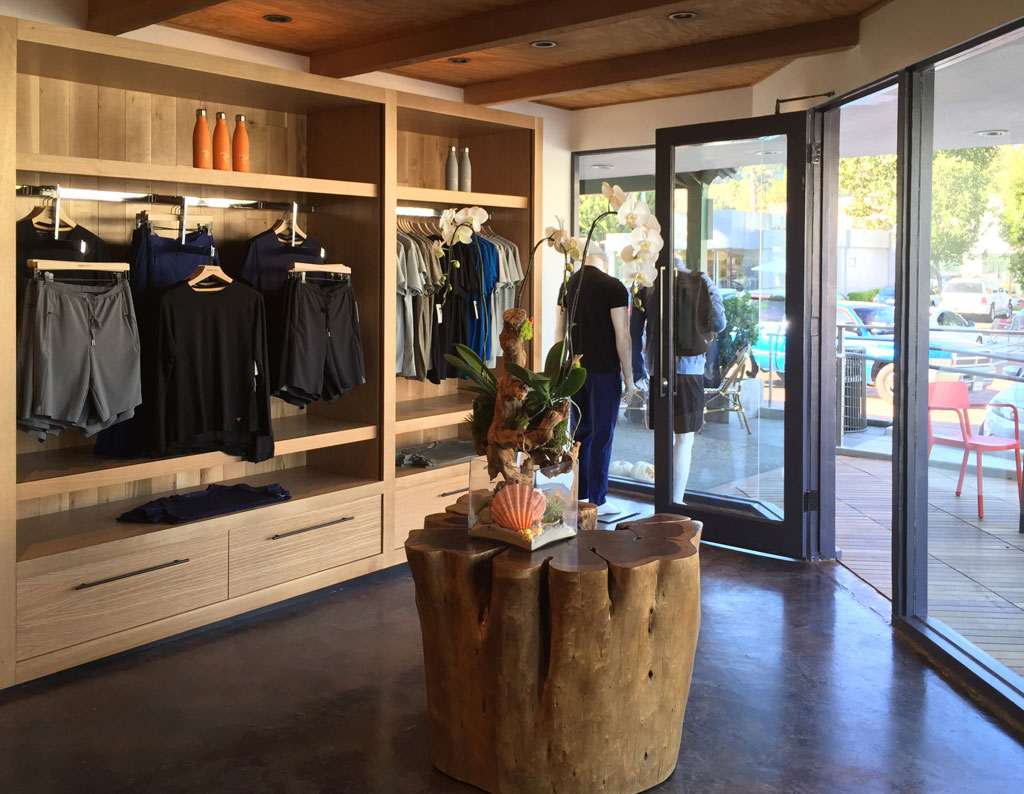
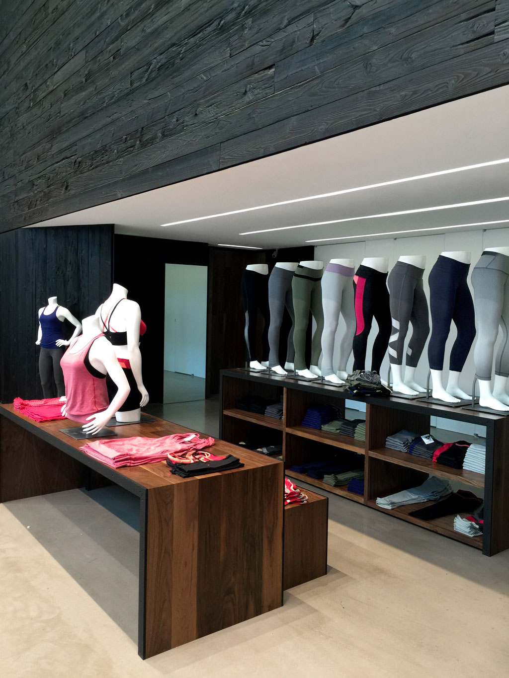
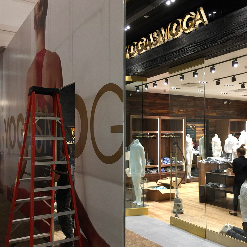
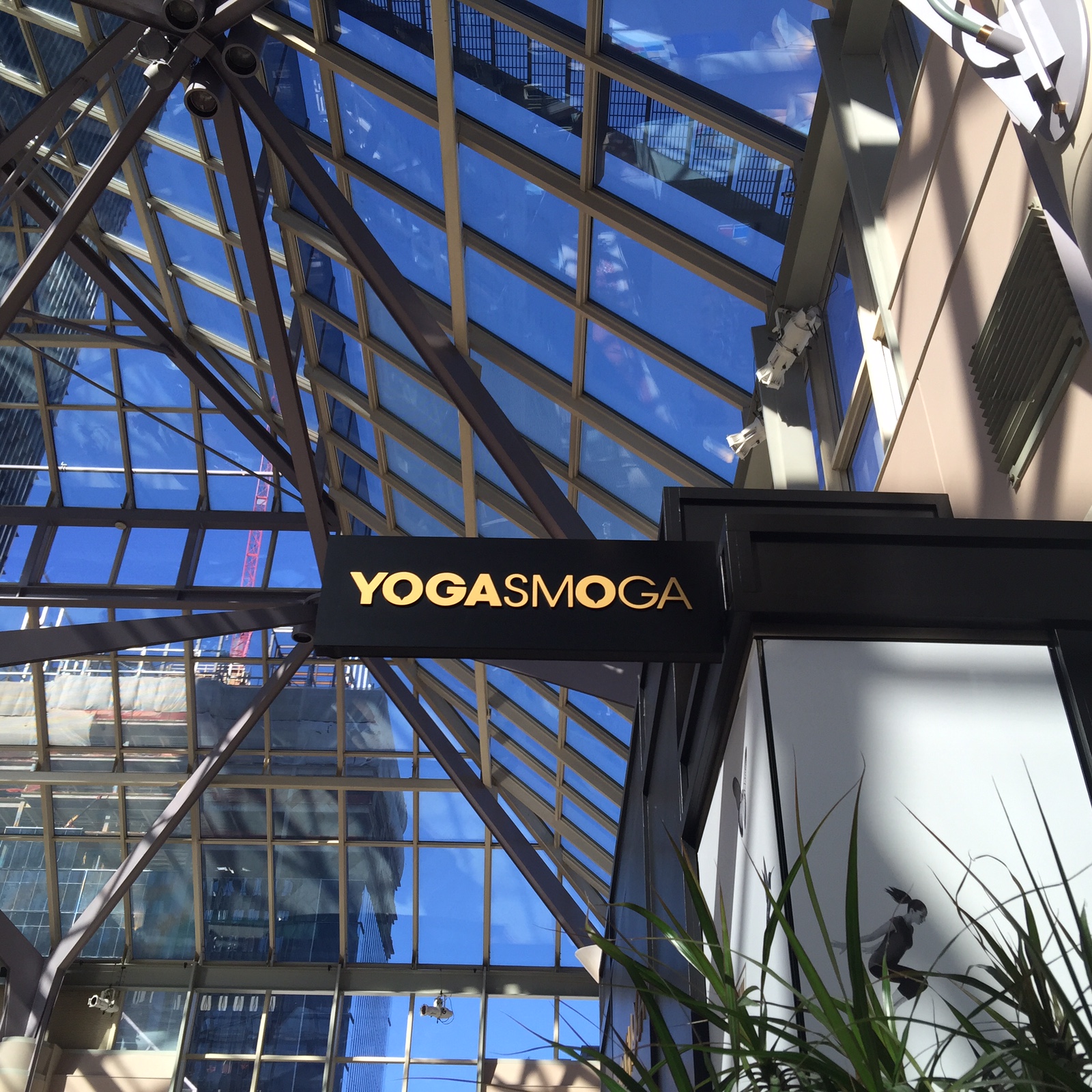
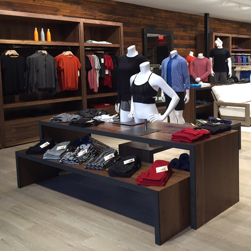
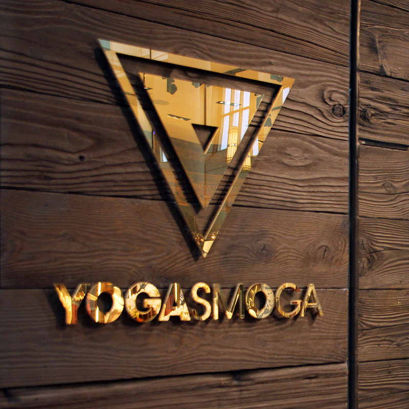
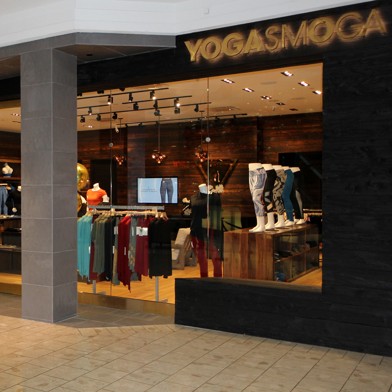
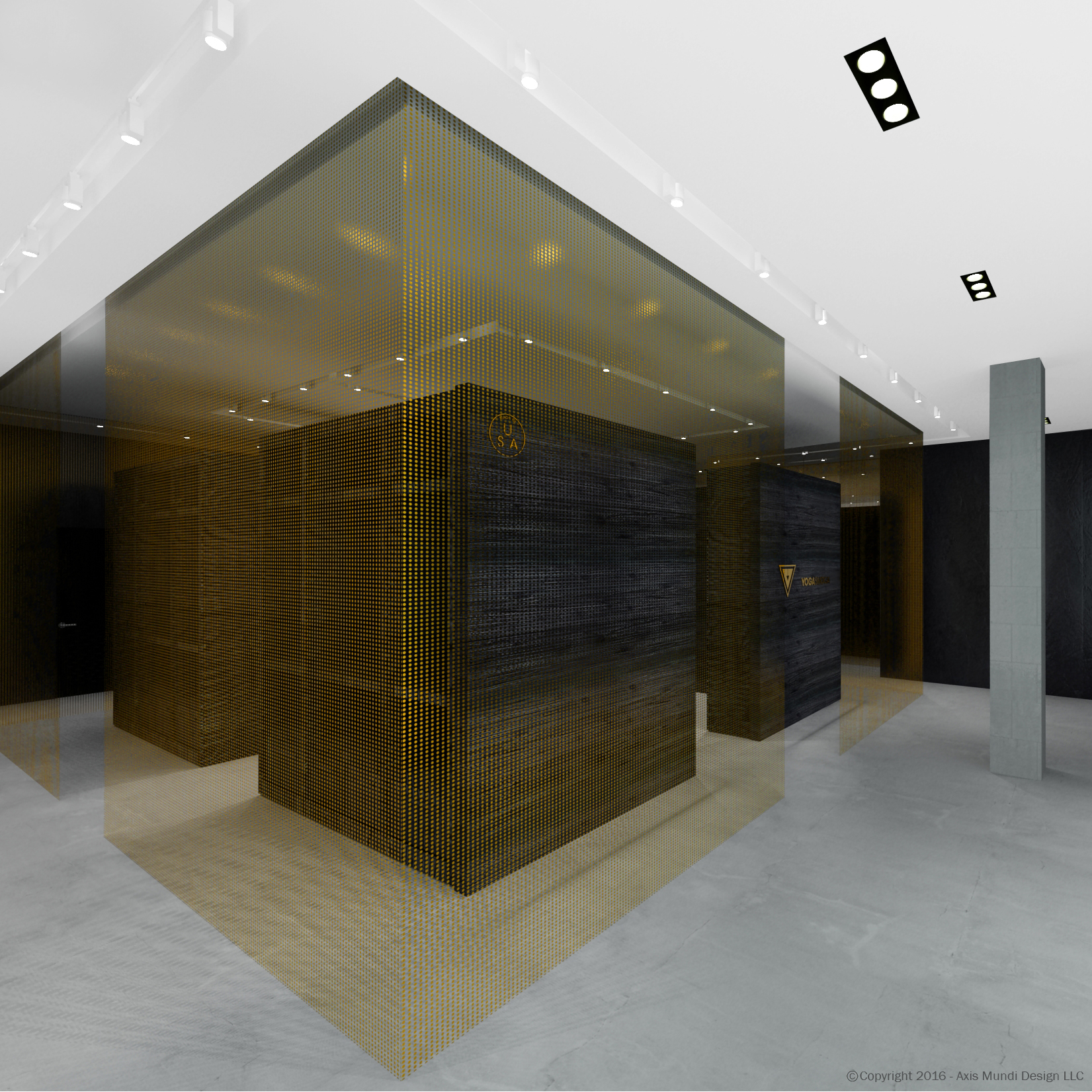
A younger generation is shaping a more conscious way of doing business. YOGASMOGA, the yoga and sports apparel company, illustrates this perfectly. They’re committed to performance-based, technologically advanced fabrics and manufacturing techniques. But their rigorous company ethos is equally concerned with the planet—no harmful chemicals, a reduced carbon footprint, and giving back to the people who produce their clothes are all part of their value system. Working with a lightening-fast roll-out, and with 10 different locations and various pop-ups, we united the aesthetic through use of a natural Japanese siding treatment that originated at least as far back as the 18th century. In shou sugi ban, woods such as cypress and hemlock are charred, doused with water, cooled, then brushed to remove dust and debris. Finally, it is finished with tung oil. The environmentally friendly method preserves the wood, eliminating the need for paints and retardants. Like Yogasmoga’s clothes, it looks great too.
YogaSmoga, Various Locations
A younger generation is shaping a more conscious way of doing business. YOGASMOGA, the yoga and sports apparel company, illustrates this perfectly. They’re committed to performance-based, technologically advanced fabrics and manufacturing techniques. But their rigorous company ethos is equally concerned with the planet—no harmful chemicals, a reduced carbon footprint, and giving back to the people who produce their clothes are all part of their value system. Working with a lightening-fast roll-out, and with 10 different locations and various pop-ups, we united the aesthetic through use of a natural Japanese siding treatment that originated at least as far back as the 18th century. In shou sugi ban, woods such as cypress and hemlock are charred, doused with water, cooled, then brushed to remove dust and debris. Finally, it is finished with tung oil. The environmentally friendly method preserves the wood, eliminating the need for paints and retardants. Like Yogasmoga’s clothes, it looks great too.
Design: John Beckmann, with Silvia Tosques and I-Hsuan Chao
© Axis Mundi Design LLC 2016-2017

Les Belles Dentistry
Les Belles Dentistry Park Sixty, 110 East 60th Street, New York
The Les Belles philosophy is centered on the belief that a healthy mouth will promote a healthier body and a more beautiful life. This patient-first approach is infused in every aspect of the practice which uses state-of-the-art technology to deliver effective pain-free treatments as well as recommendations for organic, environmentally-friendly and bio-compatible products whenever possible.
Les Belles Dentistry Park Sixty, 110 East 60th Street, New York
The Les Belles philosophy is centered on the belief that a healthy mouth will promote a healthier body and a more beautiful life. This patient-first approach is infused in every aspect of the practice which uses state-of-the-art technology to deliver effective pain-free treatments as well as recommendations for organic, environmentally-friendly and bio-compatible products whenever possible. This approach also places the practice at the forefront of a wave to transform traditional dentistry by providing an elevated experience that combines the aesthetics of luxury design with the comfort and security of top-quality products and exceptional customer service.
Their new location will include seamlessly integrated technology and digital workflow, making it a paper-free office, as well as stylish white and brass trimmings which artfully complement its ceiling-mounted flat-screen TVs which patients can use in tandem with headphones to listen to music or watch the program of their choice while they receive treatment. But the overall loveliness of the new office is only eclipsed by the exceptionalism of its staff. The practice boasts an elite team of dentists possessing diverse certifications and multiple dental specialties, including pediatric dentistry, cosmetic dentistry, dental implants, sedation dentistry, oral surgery and more.
Design Team: John Beckmann, with Hannah LaSota
Contractor: Cardinal Construction
Renderings: 3DRS
Total Area: 2500 sq.ft.
© Axis Mundi Design LLC 2018

800 5th Avenue Medical Office
800 5th Avenue Medical Office
Our client is a leading authority on foot and ankle surgery. With 17 years of major experience and a few foot specific patents under his belt, he has patients traveling from all over the globe to his offices in New York, NY and Beverly Hills, CA.
Situated at 800 5th Avenue, the office overlooks the beautiful Central Park. Inside is filled with modern design elements and precious materials like back lite onyx panels. From the use of Venetian plaster, a custom Andy Warhol print wallpaper and International Klein Blue, the office offers state-of-the-art treatments.
800 5th Avenue Medical Office
800 5th Avenue Medical Office
Our client is a leading authority on foot and ankle surgery. With 17 years of major experience and a few foot specific patents under his belt, he has patients traveling from all over the globe to his offices in New York, NY and Beverly Hills, CA.
Situated at 800 5th Avenue, the office overlooks the beautiful Central Park. Inside is filled with modern design elements and precious materials like back lite onyx panels. From the use of Venetian plaster, a custom Andy Warhol print wallpaper and International Klein Blue, the office offers state-of-the-art treatments.
800 5th Avenue Medical Office
Our client is a leading authority on foot and ankle surgery. With 17 years of major experience and a few foot specific patents under his belt, he has patients traveling from all over the globe to his offices in New York, NY and Beverly Hills, CA.
Situated at 800 5th Avenue, the office overlooks the beautiful Central Park. Inside is filled with modern design elements and precious materials like back lite onyx panels. From the use of Venetian plaster, a custom Andy Warhol print wallpaper and International Klein Blue, the office offers state-of-the-art treatments.
Design Team: John Beckmann and Nick Messerlian
Photography: Ronald Stewart
Size: 2200 sf
© Axis Mundi Design LLC. 2018

Christie's Private Galleries
Christies, New York
Exclusivity is the privilege of the connoisseur. This concept was foremost in the minds of the Axis Mundi team when the venerable Christie’s auction house tapped them to design two private galleries and two skyboxes overlooking the auction floor, amenities offered Christie’s most select coterie of collectors so they can view and bid on art while remaining invisible to public and paparazzi alike. It was essential that the scheme and materials telegraph a kind of access reserved for the elite. The skyboxes were swathed in architectural envelopes of luxurious American black walnut and zebrawood. Furnishings are by that paragon of modern chic, Jean-Michel Frank. The private galleries boast polished terrazzo, a material that elevates the de rigueur concrete we’re used to seeing. Walls—on which blue chip art is in constant rotation—are gallery white, but feature floating reveals and anodized aluminum trim that impart a sense of precision craftsmanship. Elegant and extravagant in an understated way, these skyboxes and galleries exude the sophistication demanded by an art venue of this caliber, with a clientele to match it.
Design Team: John Beckmann, Richard Rosenbloom and Nick Messerlian
Total Area: 2,200 sq.ft.
© Axis Mundi Design LLC


